

Primary Logo
Our primary logo should be the default for all of our official communications, and placed consistently across all applications to ensure the integrity of the brand and help build equity. It is important to maintain the elements that make up the logo and the relationships between them. The logo construction as it appears should never be altered.
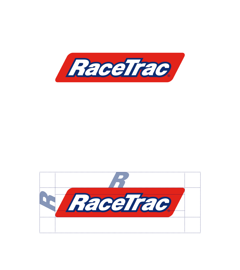
To guarantee the integrity of our logo and ensure it isn’t obstructed, it's important that it remains free from other graphic elements. The clear space is defined by the height of the “R” in our logo.
Minimum Size
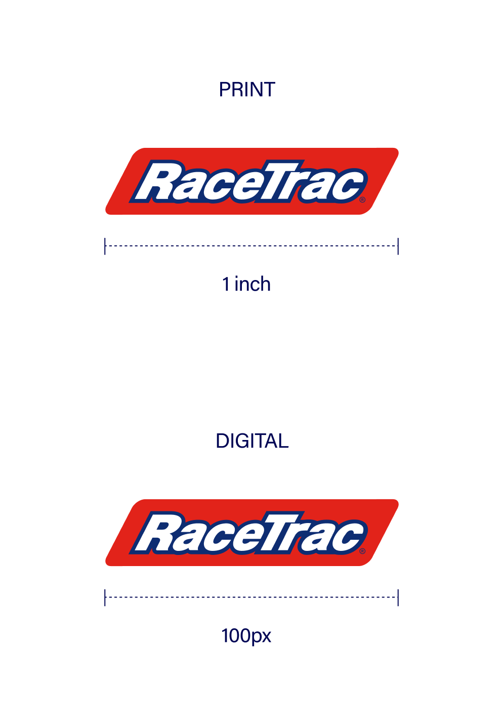
For traditional print, our RaceTrac logo on its own should never be smaller than 1 inch wide. For all digital media, the logo on its own should never be smaller than 100px wide.
Color Guidance
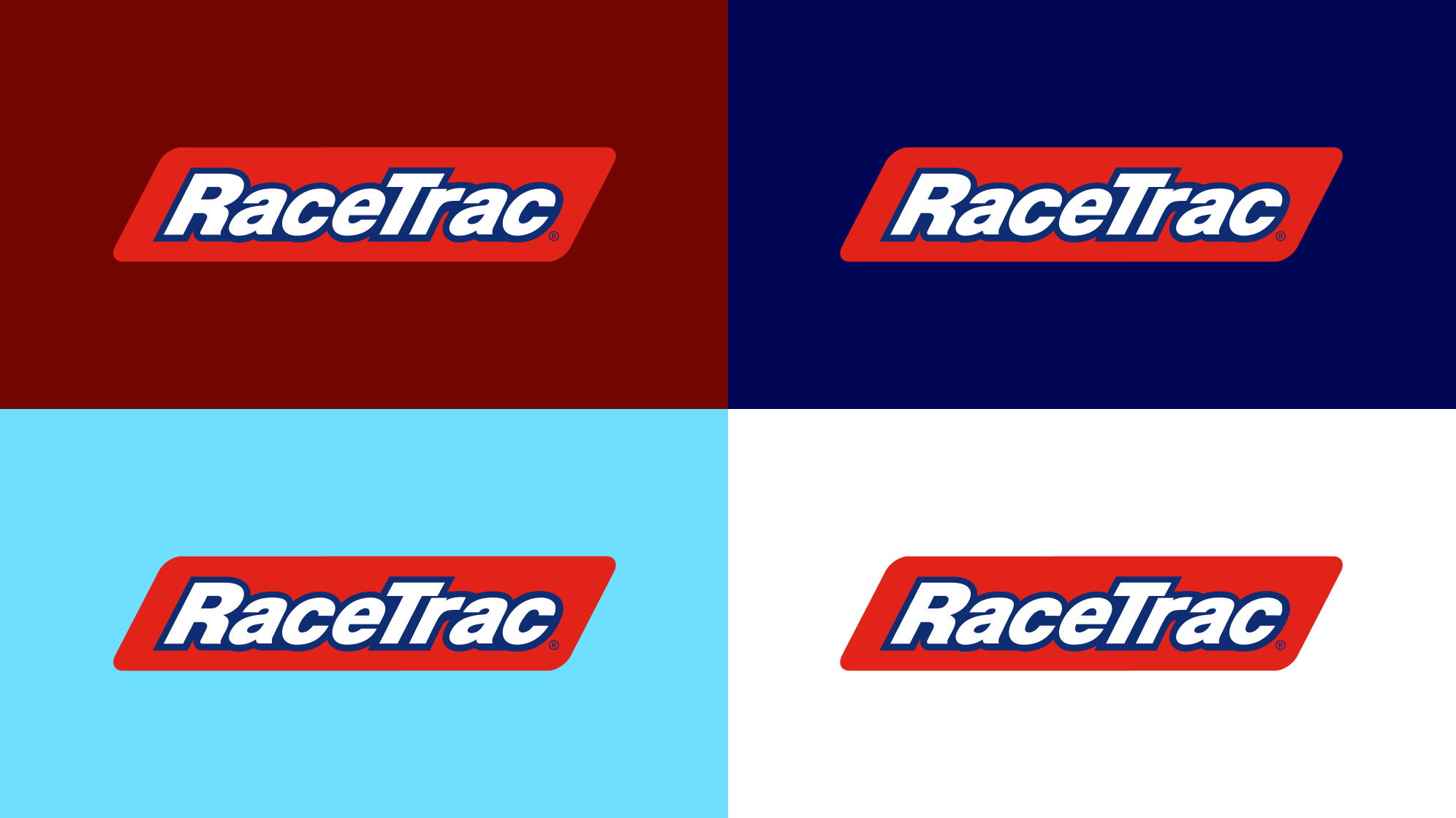
The full-color logo should always appear in red and be placed only over the approved solid colors shown below to meet accessibility and legibility standards. (never on red)
Logo Colors
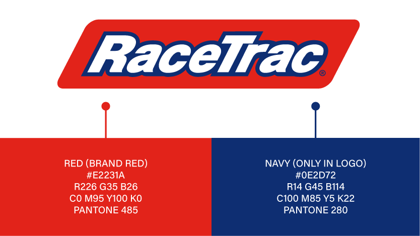
Please note that this blue is exclusive to the RaceTrac logo. Its role is specific to the logo mark and it is not intended to function as part of the broader color palette.
Logo Application
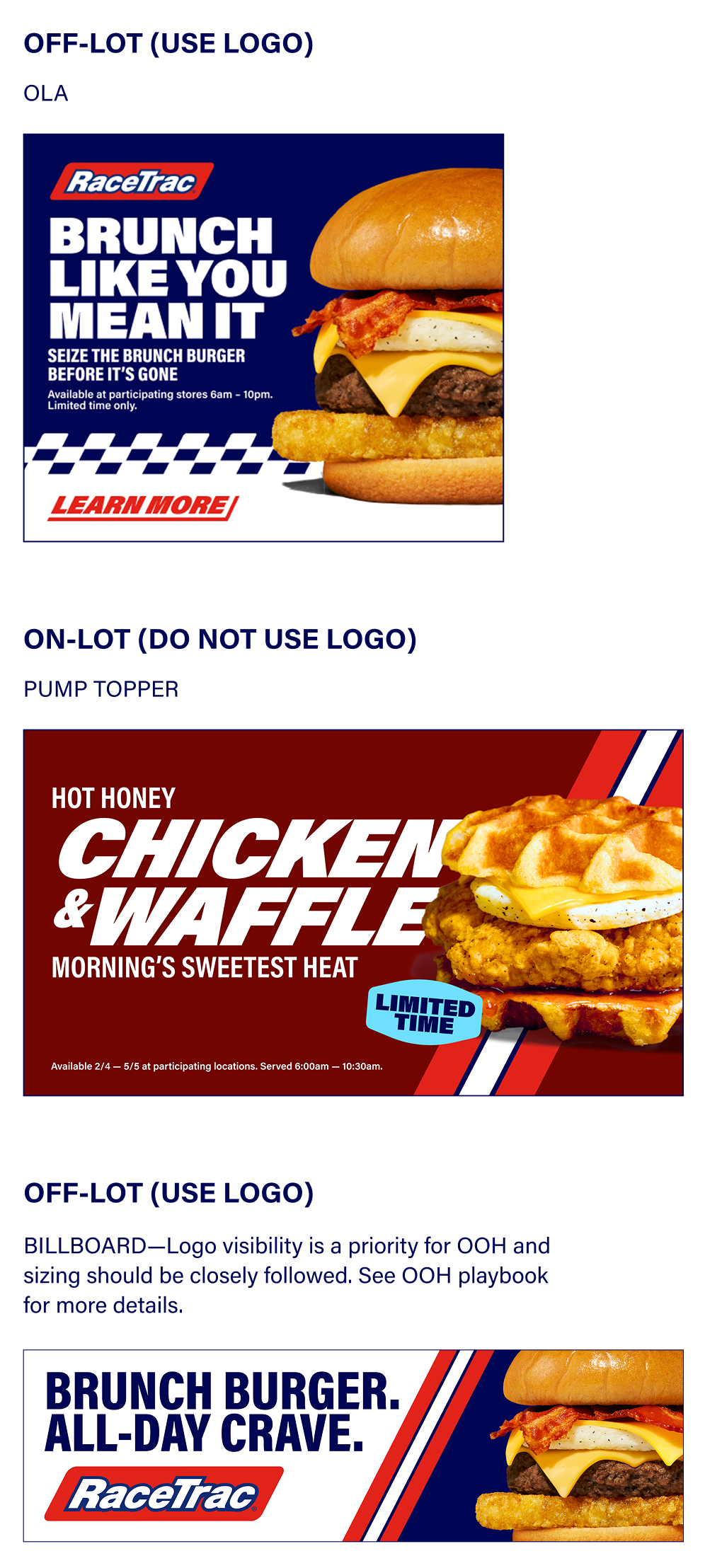
Reference the below examples for when to apply vs not apply a logo. When creating assets for off-lot usage, use logo. When creating assets for on-lot usage, do not use logo.
Primary Logo Restrictions
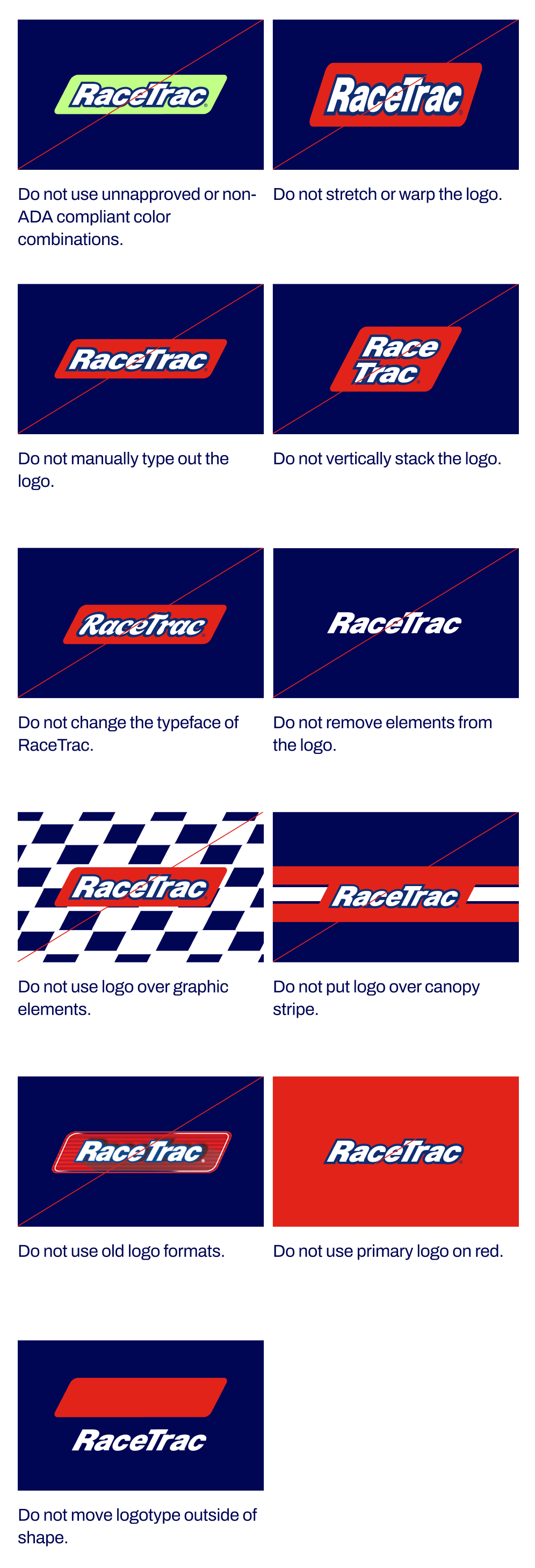
Avoid these usages and color combinations. Following these guidelines ensures consistent brand application and ADA compliance.
Logo + Tagline
Our logo + tagline includes our brand platform tagline: Whatever Gets You Going. This logo should only be used in production end cards, radio/streaming audio, A&D, and store uniforms.
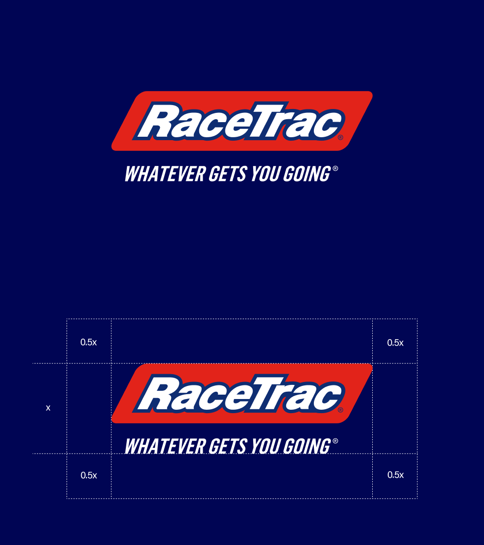
To guarantee the integrity of our logo and ensure it isn’t obstructed, it's important that it remains free from other graphic elements. The clear space is defined by the 0.5x the height of our logo.
Minimum Size
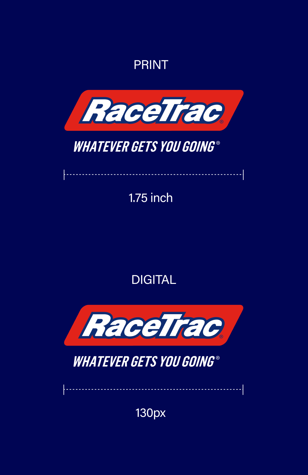
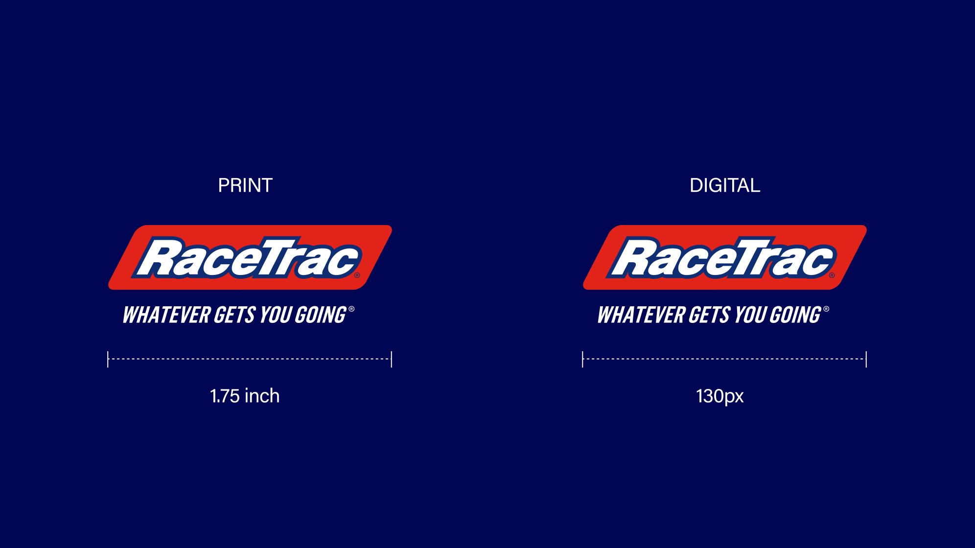
For traditional print, our logo + tagline on its own should never be smaller than 1.75 in wide. For all digital media, the logo + tagline on its own should never be smaller than 130px wide.
Color Guidance
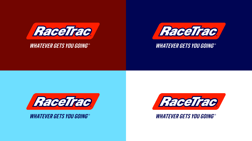
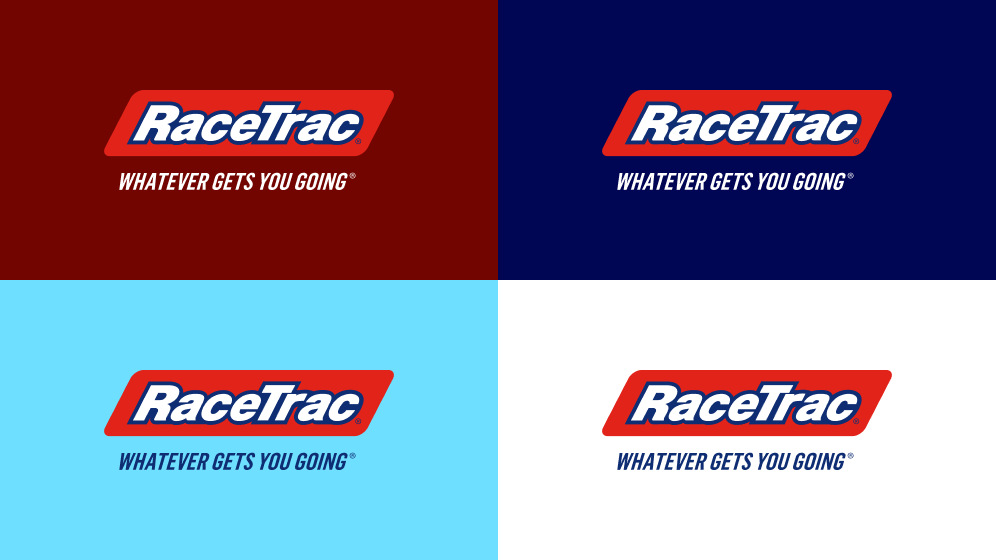
Our logo + tagline should always appear in red, and tagline should change based on the background color to meet our accessibility and legibility standards.
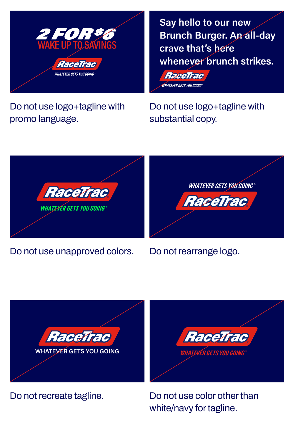
Primary Logo+Tagline Restrictions
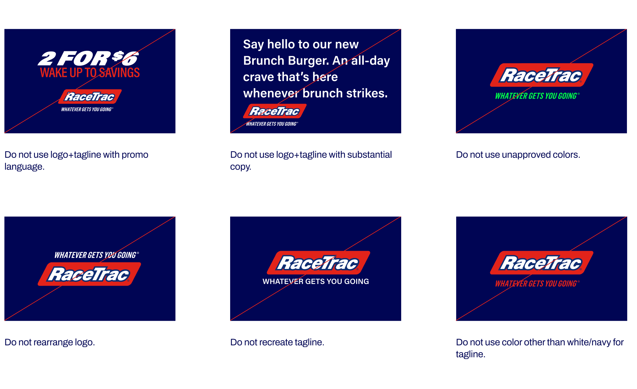
Avoid these usages and color combinations. Following these guidelines ensures consistent brand application and ADA compliance.
Primary One-Color Logo
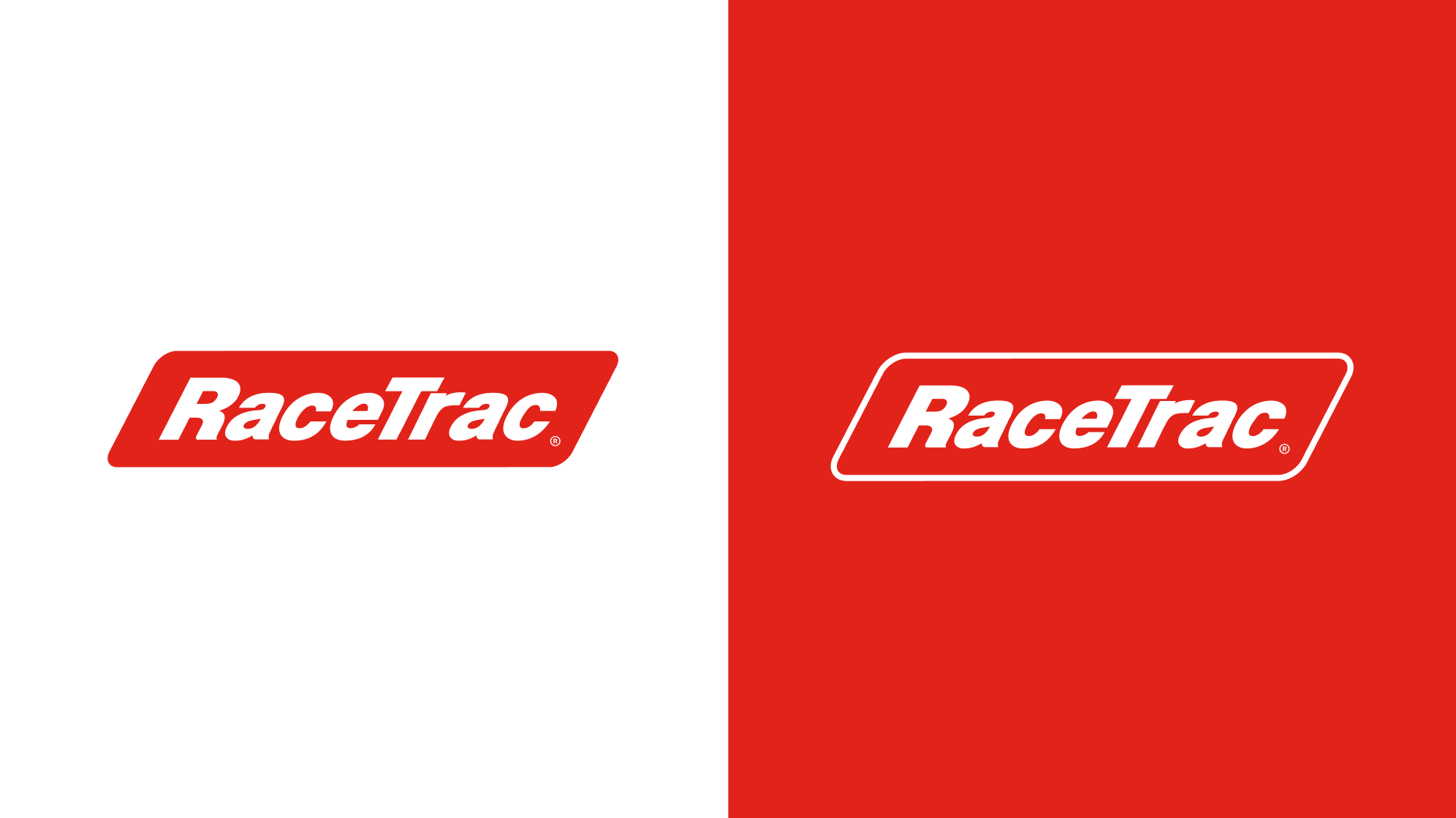
The primary one-color logo can be leveraged when we need to retain a single, primary color, but it should only be used on a white background. On red, the secondary one-color logo may be used. Always try to use full-color logo first. use should be limited to specific, infrequent scenarios. It is only appropriate in cases where production constraints require two-color printing or when a clear design need exists. The single-color logo is not restricted to red; it may be adapted to the appropriate color based on the specific application. However, the full-color logo should always be used whenever possible to maintain brand consistency and impact.
If engraving, it is our intention that the RaceTrac letters appear lighter than the parallelogram shape.
Stacked Logo
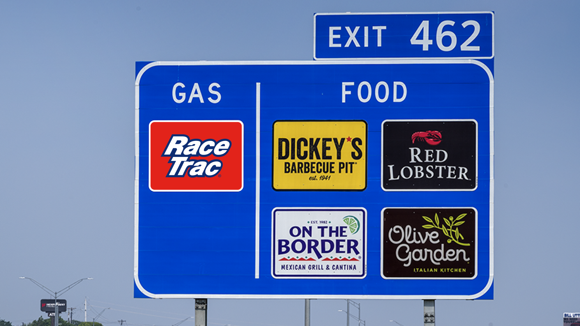
Our stacked logo is exclusively used for DOT highway signs, the RaceTrac app icon, and our social media avatar. It should only appear like the example below.
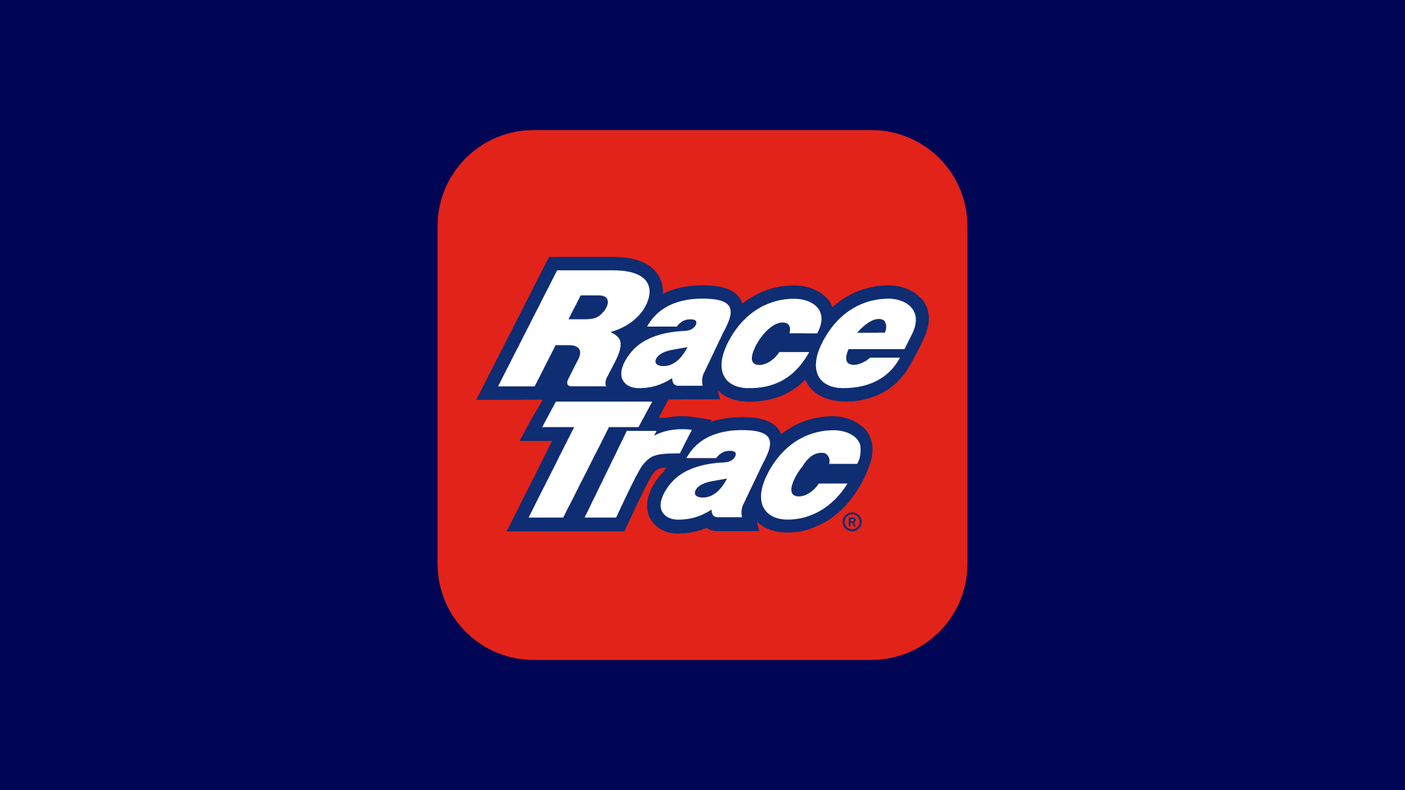
Stacked Logo: Example


Primary Logo
Our primary logo should be the default for all of our official communications, and placed consistently across all applications to ensure the integrity of the brand and help build equity. It is important to maintain the elements that make up the logo and the relationships between them. The logo construction as it appears should never be altered.
To guarantee the integrity of our logo and ensure it isn’t obstructed, it's important that it remains free from other graphic elements. The clear space is defined by the height of the “R” in our logo.
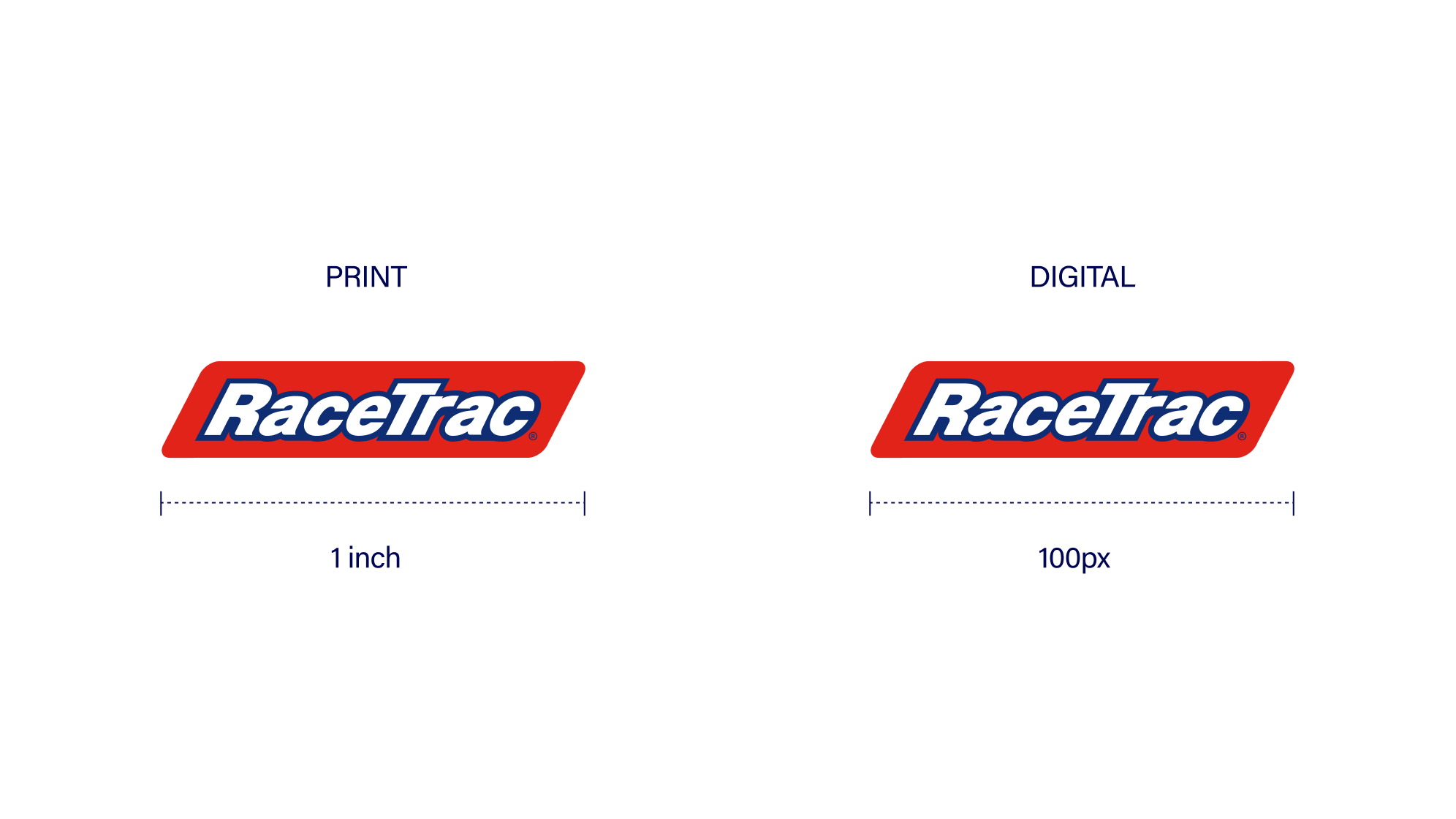
Minimum Size
For traditional print, our RaceTrac logo on its own should never be smaller than 1 inch wide. For all digital media, the logo on its own should never be smaller than 100px wide.
Color Guidance
The full-color logo should always appear in red and be placed only over the approved solid colors shown below to meet accessibility and legibility standards. (never on red)
Logo Colors
Please note that this blue is exclusive to the RaceTrac logo. Its role is specific to the logo mark and it is not intended to function as part of the broader color palette.
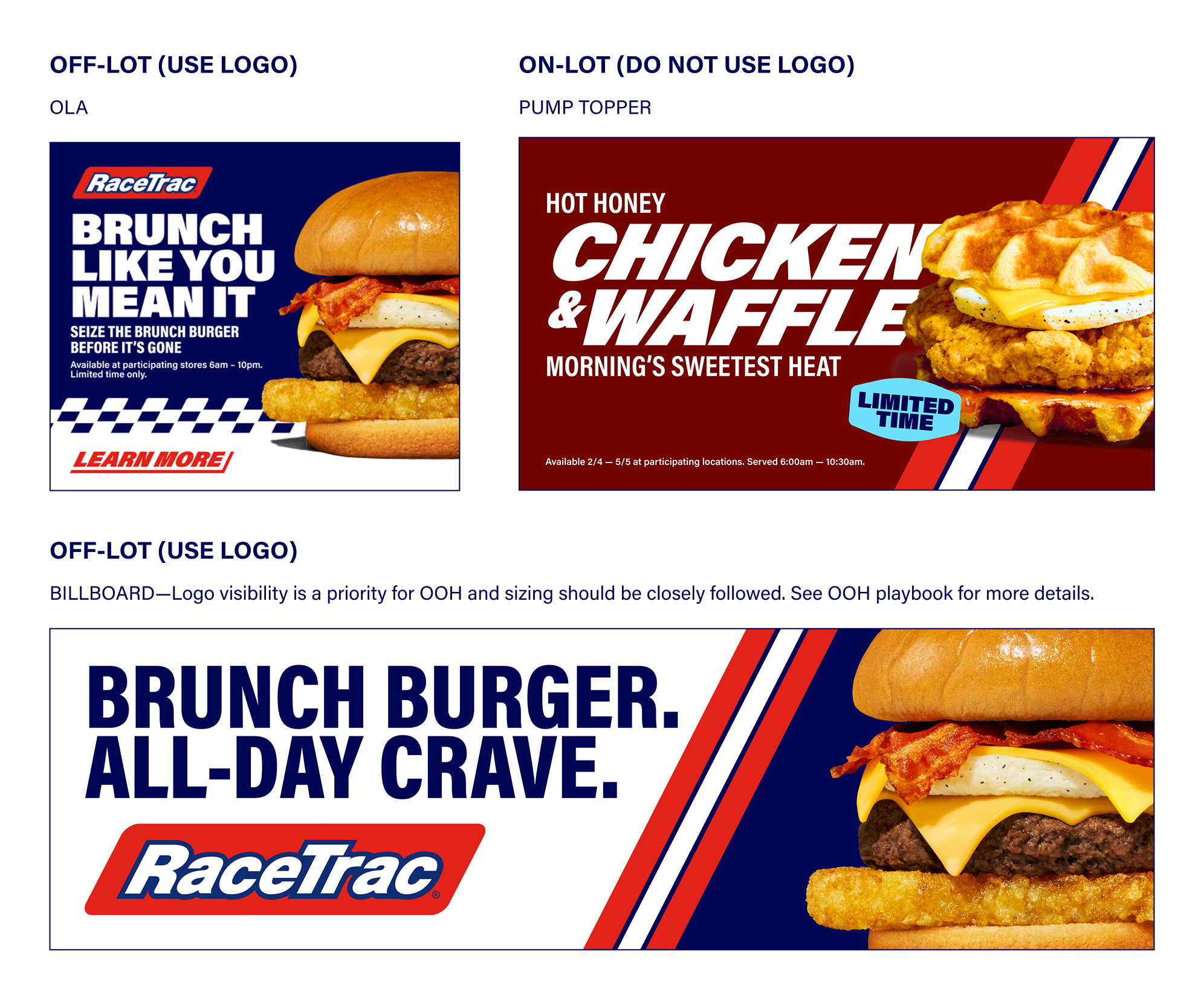
Logo Application
Reference the below examples for when to apply vs not apply a logo. When creating assets for off-lot usage, use logo. When creating assets for on-lot usage, do not use logo.
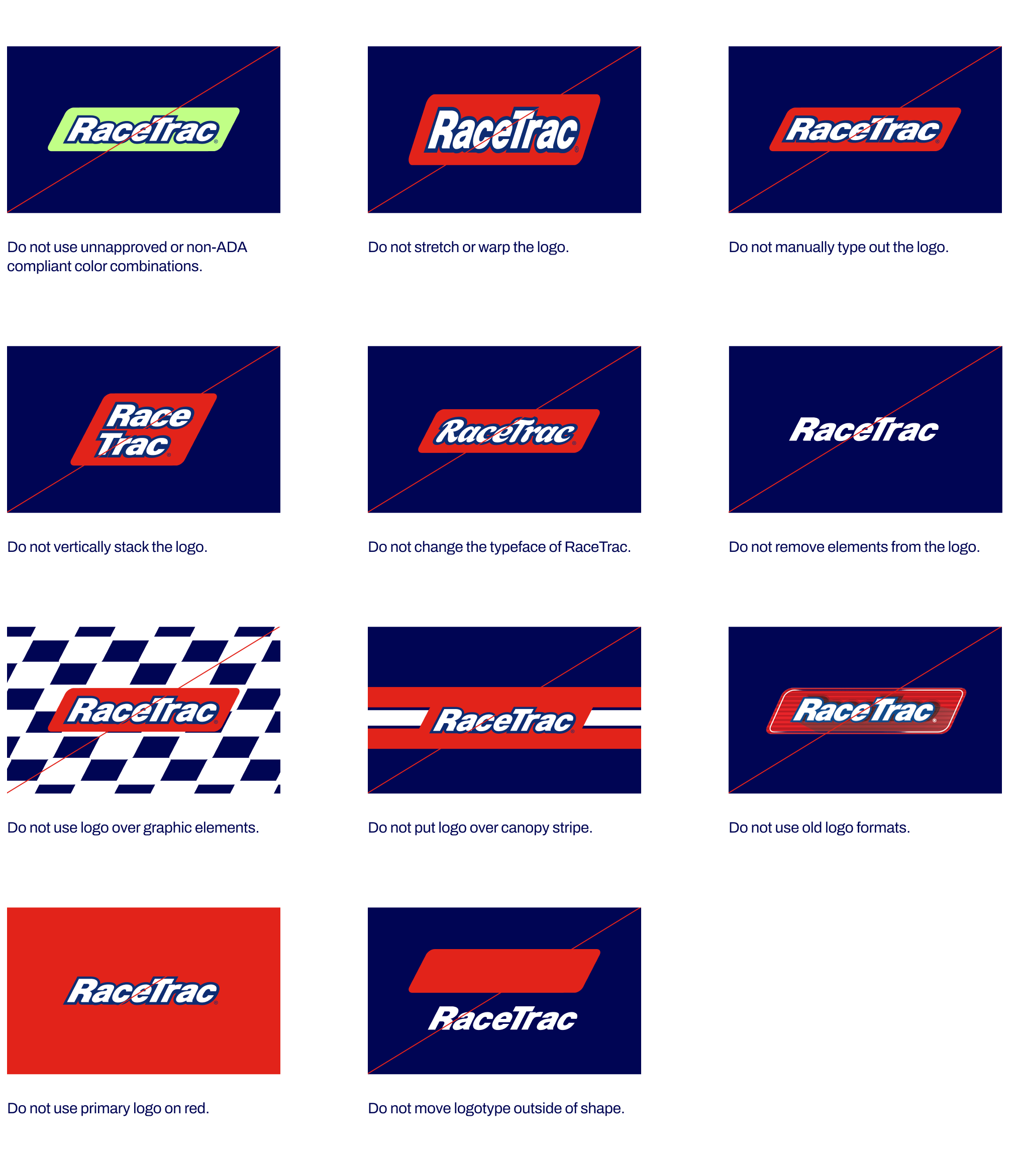
Primary Logo Restrictions
Avoid these usages and color combinations. Following these guidelines ensures consistent brand application and ADA compliance.
Logo + Tagline
Our logo + tagline includes our brand platform tagline: Whatever Gets You Going. This logo should only be used in production end cards, radio/streaming audio, A&D, and store uniforms.
To guarantee the integrity of our logo and ensure it isn’t obstructed, it's important that it remains free from other graphic elements. The clear space is defined by the 0.5x the height of our logo.
Minimum Size
For traditional print, our logo + tagline on its own should never be smaller than 1.75 in wide. For all digital media, the logo + tagline on its own should never be smaller than 130px wide.
Color Guidance
Our logo should always appear in red, and tagline should appear in white or navy depending on background color guidance below.
Primary Logo+Tagline Restrictions
Avoid these usages and color combinations. Following these guidelines ensures consistent brand application and ADA compliance.
Primary One-Color Logo
The primary one-color logo can be leveraged when we need to retain a single, primary color, but it should only be used on a white background. On red, the secondary one-color logo may be used. Always try to use full-color logo first. use should be limited to specific, infrequent scenarios. It is only appropriate in cases where production constraints require two-color printing or when a clear design need exists. The single-color logo is not restricted to red; it may be adapted to the appropriate color based on the specific application. However, the full-color logo should always be used whenever possible to maintain brand consistency and impact.
If engraving, it is our intention that the RaceTrac letters appear lighter than the parallelogram shape.
Stacked Logo
Our stacked logo is exclusively used for DOT highway signs, the RaceTrac app icon, and our social media avatar. It should only appear like the example below.
Stacked Logo: Example
Brand Overview
Brand Voice
Logo
Colors
Typography
Imagery
Graphic Elements
Layout + Application
Partnerships
Downloads + FAQs
Primary Logo
Our primary logo should be the default for all of our official communications, and placed consistently across all applications to ensure the integrity of the brand and help build equity. It is important to maintain the elements that make up the logo and the relationships between them. The logo construction as it appears should never be altered.
To guarantee the integrity of our logo and ensure it isn’t obstructed, it's important that it remains free from other graphic elements. The clear space is defined by the height of the “R” in our logo.
Minimum Size
For traditional print, our RaceTrac logo on its own should never be smaller than 1 inch wide. For all digital media, the logo on its own should never be smaller than 100px wide.
Color Guidance
The full-color logo should always appear in red and be placed only over the approved solid colors shown below to meet accessibility and legibility standards. (never on red)
Logo Colors
Please note that this blue is exclusive to the RaceTrac logo. Its role is specific to the logo mark and it is not intended to function as part of the broader color palette.
Logo Application
Reference the below examples for when to apply vs not apply a logo. When creating assets for off-lot usage, use logo. When creating assets for on-lot usage, do not use logo.
Primary Logo Restrictions
Avoid these usages and color combinations. Following these guidelines ensures consistent brand application and ADA compliance.
Logo + Tagline
Our logo + tagline includes our brand platform tagline: Whatever Gets You Going. This logo should only be used in production end cards, radio/streaming audio, A&D, and store uniforms.
To guarantee the integrity of our logo and ensure it isn’t obstructed, it's important that it remains free from other graphic elements. The clear space is defined by the 0.5x the height of our logo.
Minimum Size
For traditional print, our logo + tagline on its own should never be smaller than 1.75 in wide. For all digital media, the logo + tagline on its own should never be smaller than 130px wide.
Color Guidance
Our logo should always appear in red, and tagline should appear in white or navy depending on background color guidance below.
Primary Logo+Tagline Restrictions
Avoid these usages and color combinations. Following these guidelines ensures consistent brand application and ADA compliance.
Primary One-Color Logo
The primary one-color logo should be limited to specific, infrequent scenarios. It is only appropriate in cases where production constraints require two-color printing or when a clear design need exists. The single-color logo is not restricted to red; it may be adapted to the appropriate color based on the specific application. The full-color logo should always be used whenever possible to maintain brand consistency and impact.
If engraving, it is our intention that the RaceTrac letters appear lighter than the parallelogram shape.
Stacked Logo
Our stacked logo is exclusively used for DOT highway signs, the RaceTrac app icon, and our social media avatar. It should only appear like the example below.
Stacked Logo: Example