

Primary Colors
Our primary palette is the core of our identity; at least one color should always be present in an execution. Red can only be used as a background color for on-lot creative. White should not be used as full background colors, except for special use cases such as DOT signage, OOH, etc. It should only take up a maximum of approximately 50% of the background color.
light blue
#6EDFFF
R110 G223 B255
c46 m0 y2 k0
Pantone 297C
Maroon
#720500
R114 G5 B0
c31 m100 y100 k45
Pantone 4102c
Red
#E2231A
R226 G35 B26
C0 M95 Y100 K0
Pantone 485
Navy
#000554
R0 G5 B84
C100 M98 y26 k42
Pantone 2758c
white
#FFFFFF
R255 g255 b255
C0 M0 Y0 K0
Secondary Color
Our secondary color is there if a bold pop is needed alongside one of our primary colors. It should never be used as the main background color in an execution.
pink
#FF4084
R255 G64 B132
c0 m88 y18 k0
Pantone 1915C
Available Color Pairings
The below displays proper pairings to use within layouts. Only use 3-5 colors per layout, including the dominant color.
The larger circles represent the main background color that should be used. The smaller circles are acceotable accent
Navy Background + Accent Colors

Maroon Background + Accent Colors

Light Blue Background + Accent Colors

Red Background + Accent Colors
Red backgrounds should be used on-lot only.

White Background + Accent Colors
White as a primary background color should only be used in limited use-cases (e.g. split-screen OOH) - and never as the backdrop for food.

Navy Background + Accent Colors
Color Proportions
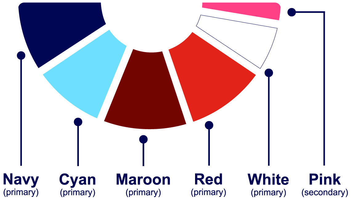
Use the proportions shown as a guide when applying the brand color palette. Navy, cyan, maroon, and red may be used as primary colors, while pink should be reserved for small accent moments rather than backgrounds or dominant applications.
Available Color Pairings
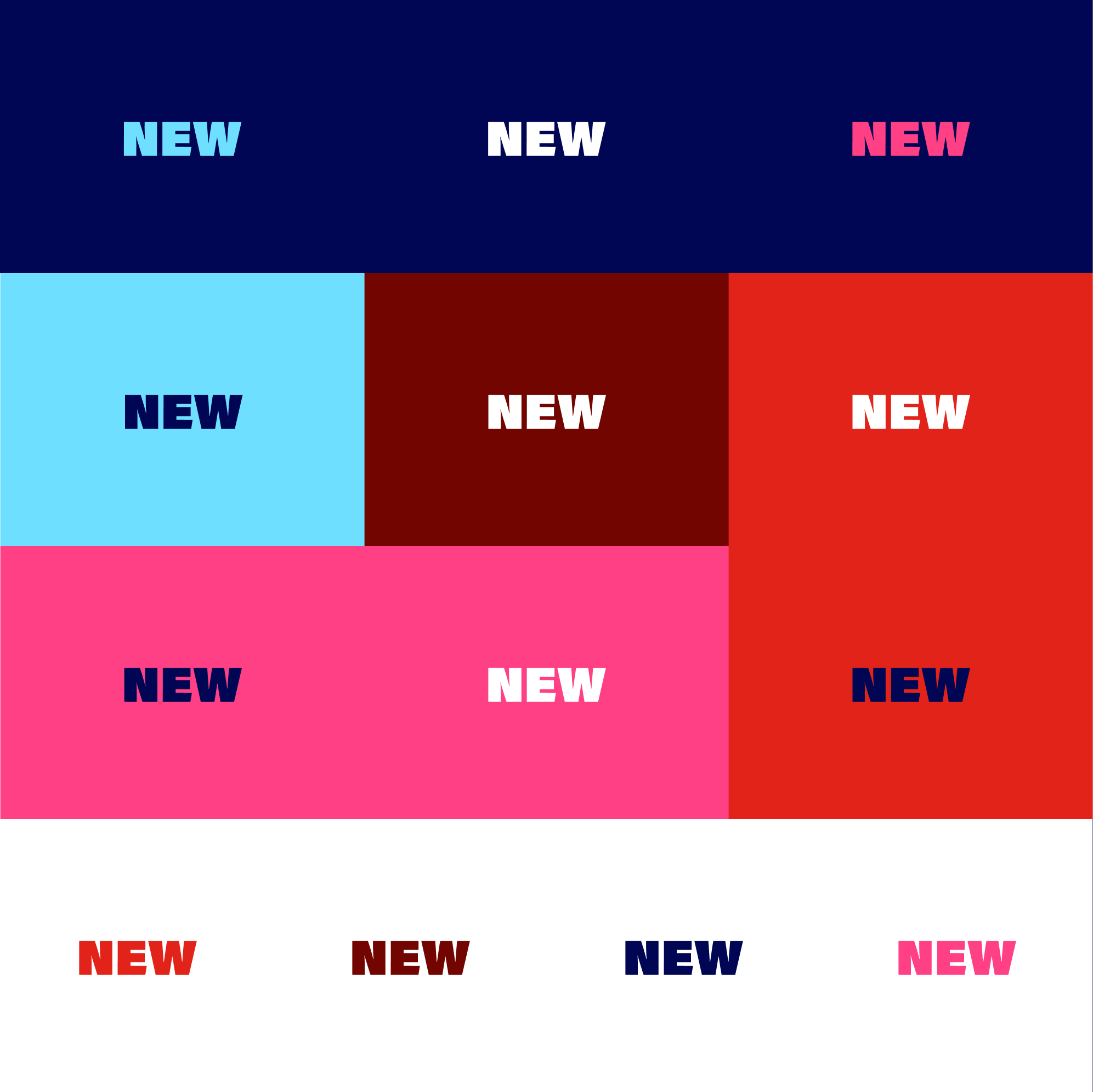
The below color chart is a curated set of color pairings to ensure ADA compliance.
Color Restrictions
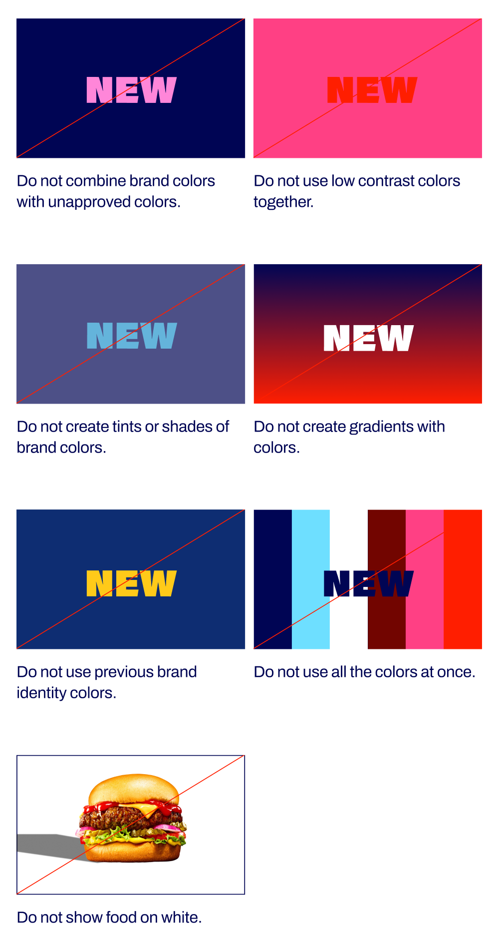
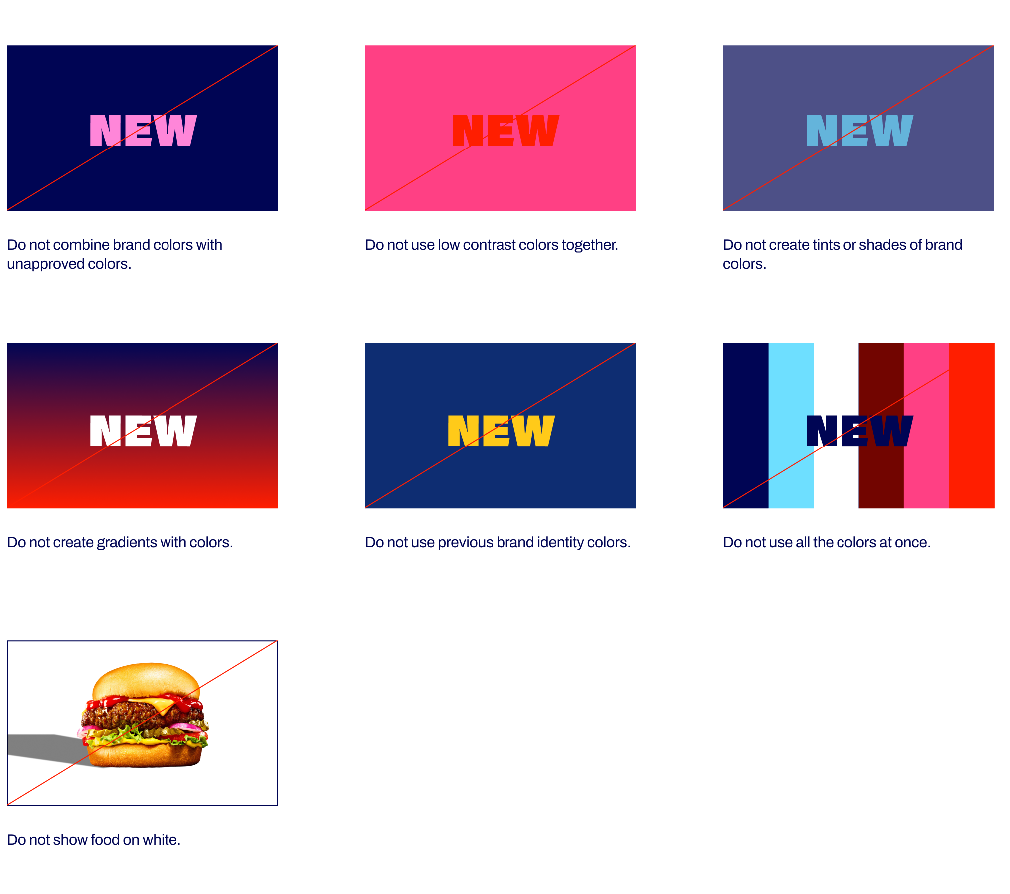
Avoid using these color combinations. Following these guidelines ensures consistent brand application and ADA compliance.


Primary Colors
Our primary palette is the core of our identity; at least one color should always be present in an execution. Red can only be used as a background color for on-lot creative. White should not be used as full background colors, except for special use cases such as DOT signage, OOH, etc. It should only take up a maximum of approximately 50% of the background color.
Red
#E2231A
R226 G35 B26
C0 M95 Y100 K0
Pantone 485
Maroon
#720500
R114 G5 B0
c31 m100 y100 k45
Pantone 4102c
light blue
#6EDFFF
R110 G223 B255
c46 m0 y2 k0
Pantone 297C
Navy
#000554
R0 G5 B84
C100 M98 y26 k42
Pantone 2758c
white
#FFFFFF
R255 g255 b255
C0 M0 Y0 K0
Secondary Color
Our secondary color is there if a bold pop is needed alongside one of our primary colors. It should never be used as the main background color in an execution.
pink
#FF4084
R255 G64 B132
c0 m88 y18 k0
Pantone 1915C
Color Application & Proportions
The below displays proper pairings to use within layouts. Only use 3-5 colors per layout, including the dominant color.
The larger circles represent the main background color that should be used. The smaller circles are acceotable accent
Navy Background + Accent Colors
Maroon Background + Accent Colors
Light Blue Background + Accent Colors
Red Background + Accent Colors
Red backgrounds should be used on-lot only.
White Background + Accent Colors
White as a primary background color should only be used in limited use-cases (e.g. split-screen OOH) - and never as the backdrop for food.
Color Proportions
Use the proportions shown as a guide when applying the brand color palette. Navy, cyan, maroon, and red may be used as primary colors, while pink should be reserved for small accent moments rather than backgrounds or dominant applications.
Available Type Color Pairings
The below color chart is a curated set of color pairings to ensure ADA compliance.
Color Restrictions
Avoid using these color combinations. Following these guidelines ensures consistent brand application and ADA compliance.
Brand Overview
Brand Voice
Logo
Colors
Typography
Imagery
Graphic Elements
Layout + Application
Partnerships
Downloads + FAQs
Primary Colors
Our primary palette is the core of our identity; at least one color should always be present in an execution. Red can only be used as a background color for on-lot creative. White should not be used as full background colors, except for special use cases such as DOT signage, OOH, etc. It should only take up a maximum of approximately 50% of the background color.
Navy
#000554
R0 G5 B84
C100 M98 y26 k42
Pantone 2758c
Red
#E2231A
R226 G35 B26
C0 M95 Y100 K0
Pantone 485
Maroon
#720500
R114 G5 B0
c31 m100 y100 k45
Pantone 4102c
light blue
#6EDFFF
R110 G223 B255
c46 m0 y2 k0
Pantone 297C
white
#FFFFFF
R255 g255 b255
C0 M0 Y0 K0
Secondary Color
Our secondary color is there if a bold pop is needed alongside one of our primary colors. It should never be used as the main background color in an execution.
pink
#FF4084
R255 G64 B132
c0 m88 y18 k0
Pantone 1915C
Color Application & Proportions
Here are some examples of how to apply our color palette within layout. Dominate colors should always be Navy, Light Blue, or Maroon except in limited-use cases.
There may be exceptions where campaigns (LTO, seasonal promotions, etc.) may use colors not listed in the guidelines to differentiate in the marketplace and draw attention to our top promotions when appropriate. All exceptions need to be approved by the RT brand team.
Navy Background + Accent Colors
Maroon Background + Accent Colors
Light Blue Background + Accent Colors
Red Background + Accent Colors
Red backgrounds should be used on-lot only.
White Background + Accent Colors
White as a primary background color should only be used in limited use-cases (e.g. split-screen OOH) - and never as the backdrop for food.
Color Proportions
Use the proportions shown as a guide when applying the brand color palette. Navy, cyan, maroon, and red may be used as primary colors, while pink should be reserved for small accent moments rather than backgrounds or dominant applications.
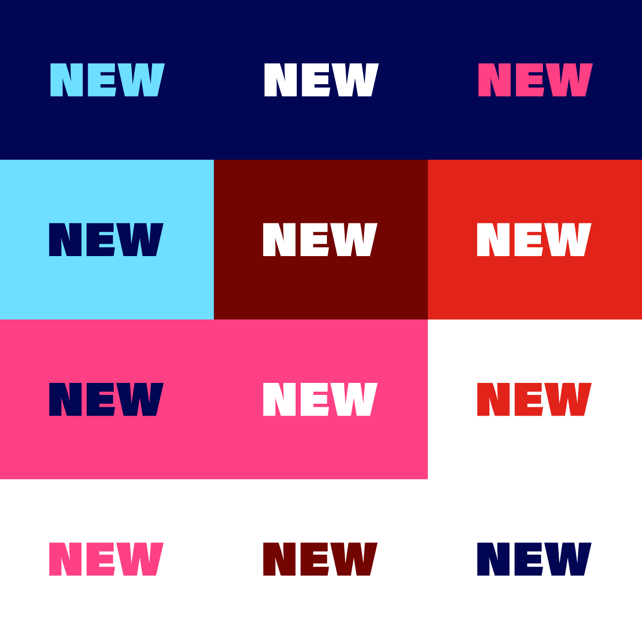
Available Type Color Pairings
The below color chart is a curated set of color pairings to ensure ADA compliance.
Color Restrictions
Avoid using these color combinations. Following these guidelines ensures consistent brand application and ADA compliance.