

Primary Typeface
Our typographic system is intentionally structured yet flexible. Rather than prescribing a single rigid application, it establishes a framework that supports a range of expressions while preserving clarity, hierarchy, and ease of reading.
All headlines and subheads should be in all-caps with no punctuation, unless punctuation is needed to separate sentences, ask questions, etc. Body copy should be sentence case with punctuation.
Arial may be used for internal materials. For final creative, use Acumin Pro, available through Adobe Creative Cloud. Contact the Creative team to request access.
Billboard-Specific Type Application
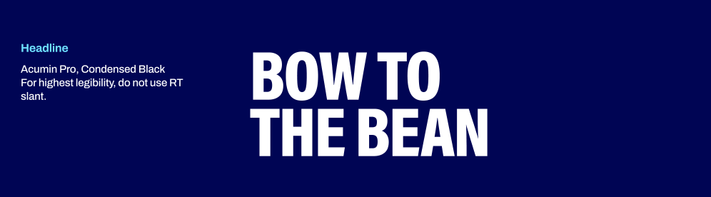
OOH headlines should be short, bold, and easy to read at a glance. Use Acumin Pro Condensed Black for headlines without the RaceTrac slant. Disclaimers are not required on OOH creative, as they are not legible to guests at typical viewing distances.
RaceTrac Slant
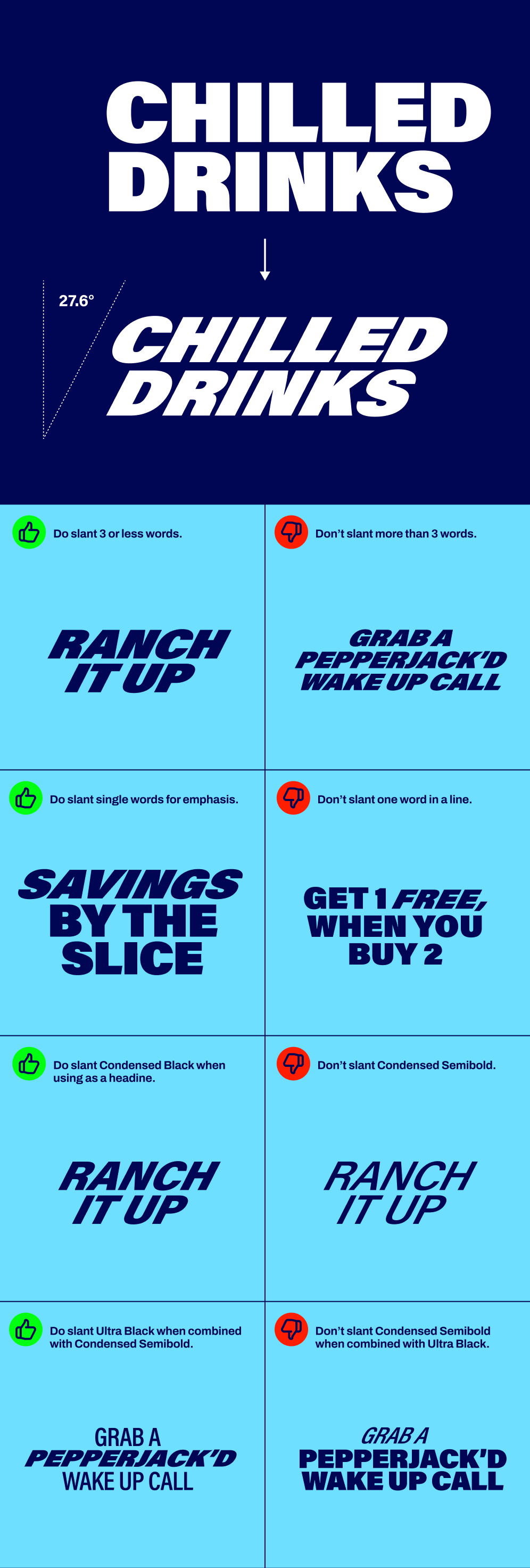
In instances where we use short headlines (3 words or under) or need to emphasize specific words, type should be skewed to match the angle of the RaceTrac logo.
Note: readability is the primary objective in general for type.
Type Examples
Primary Type Sizing
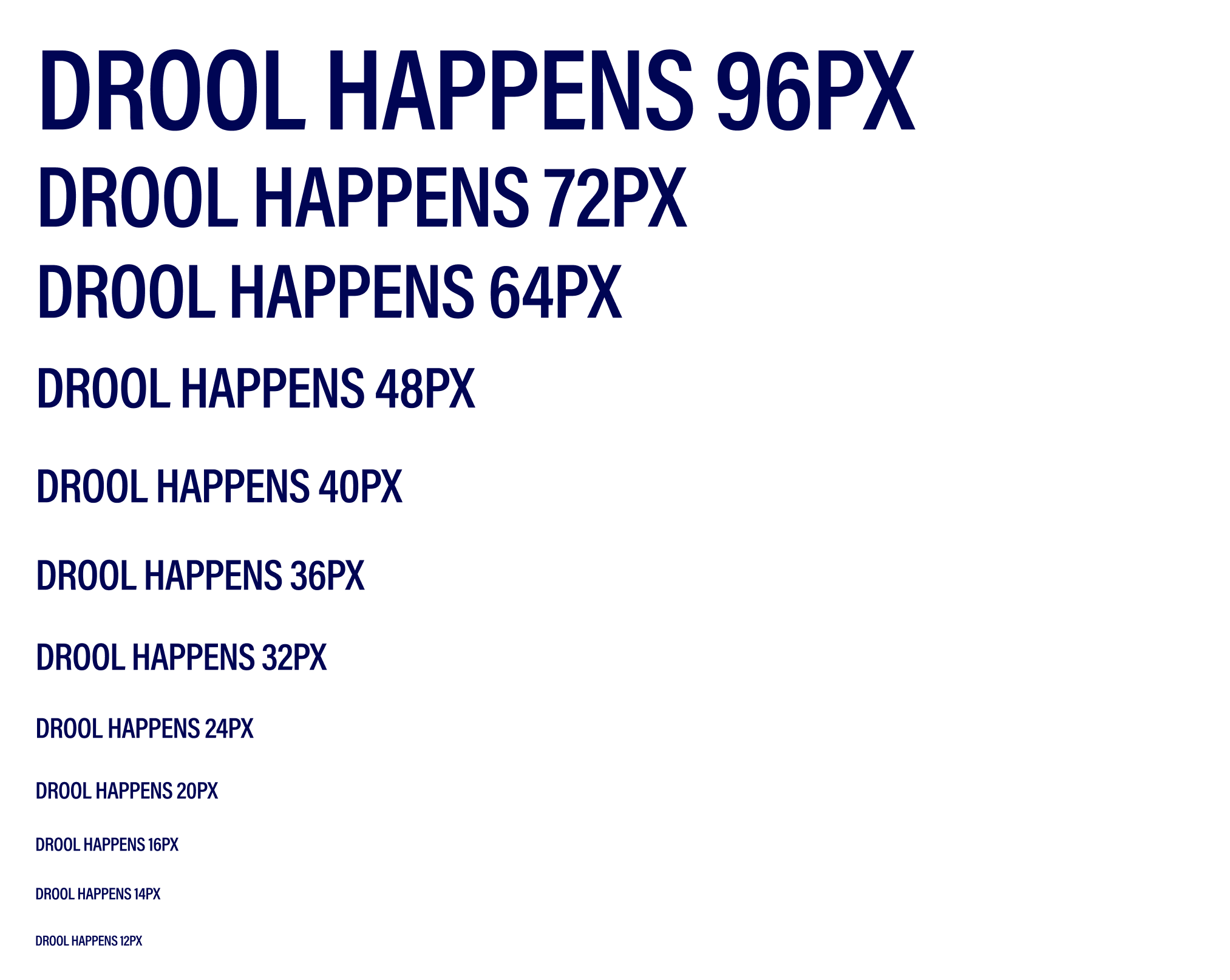
Always use traditional type sizes. When paired with the specified leading proportions, this will give you a clean baseline grid that aligns with typical screen sizes. Choose type sizes using multiples of 8 as needed.
Typographic Styles
Sizes are ratio-driven, starting with the headline as our base value.
For the best harmony with traditional screen & print resolutions, we recommend common type sizes of 8, 9, 12, 14, 18, 24, 36, 48, 56, 64, 72, 96, etc.
The guides below dictate the default styling of the brand typeface.
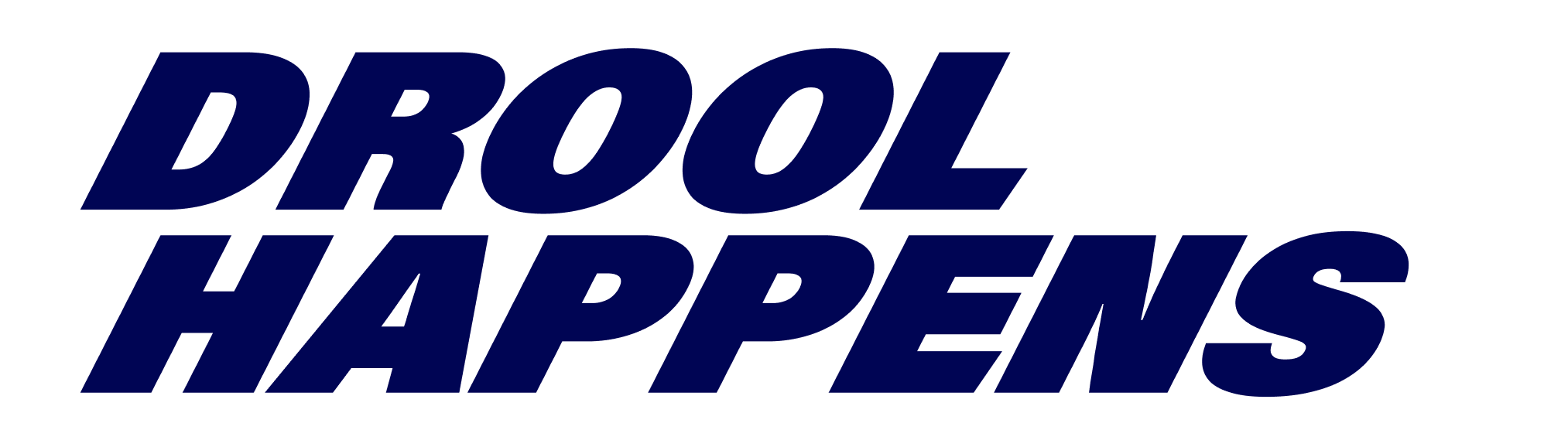
Headline
Font Family: Acumin Pro
Weight: Ultra Black, Condensed Semibold, Condensed Black
Tracking: -20
Size: 8, 9, 12, 14, 18, 24, 36, 48, 56, 64, 72, 96, etc.
Leading: Headline divided by 1.2
Text Style: Uppercase
Paragraph Alignment: Left, Right, or Centered
Subhead
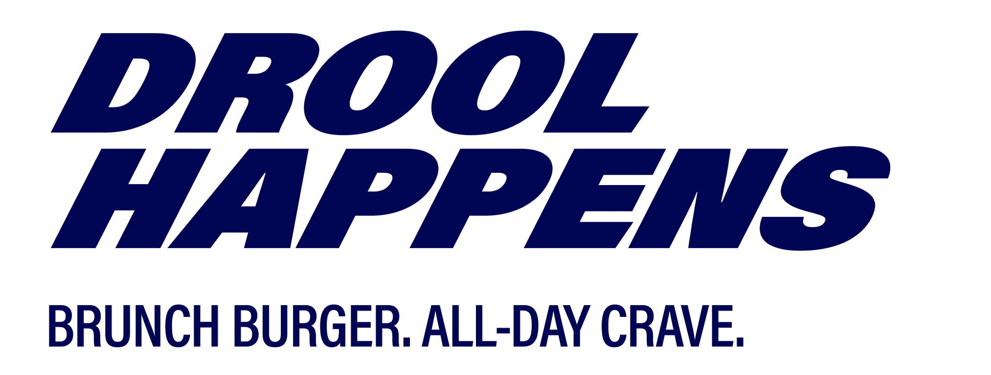
Font Family: Acumin Pro
Weight: Condensed Semibold, Condensed Black
Tracking: -20
Size: 8, 9, 12, 14, 18, 24, 36, 48, 56, 64, 72, 96, etc.
Leading: Headline divided by 1.2
Text Style: Uppercase
Paragraph Alignment: Left, Right, or Centered
Body
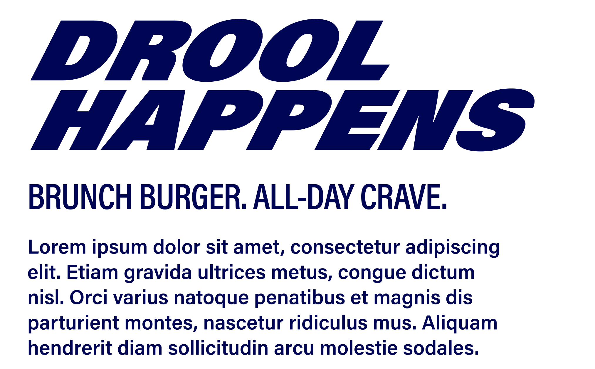
Font Family: Acumin Pro
Weight: Semibold
Tracking: 0
Size: 8, 9, 12, 14, 18, 24, 36, 48, 56, 64, 72, 96, etc.
Leading: 1.5x font size
Text Style: Sentence Case
Paragraph Alignment: Left, Right, or Centered
Qualifier
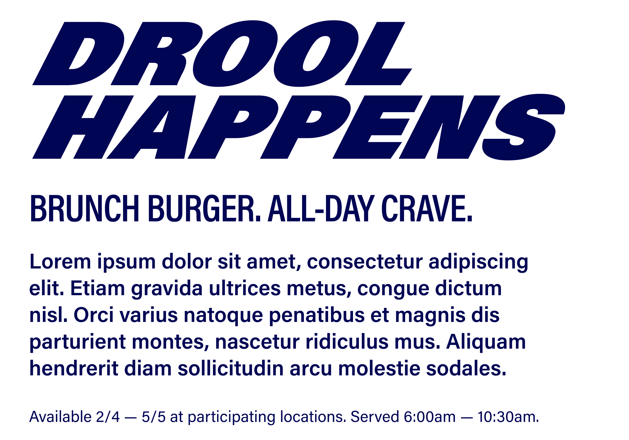
Font Family: Acumin Pro
Weight: Regular
Tracking: 0
Size: 8, 9, 12, 14, 18, 24, 36, 48, 56, 64, 72, 96, etc.
Leading: 1.5x font size
Text Style: Sentence Case
Paragraph Alignment: Left, Right, or Centered
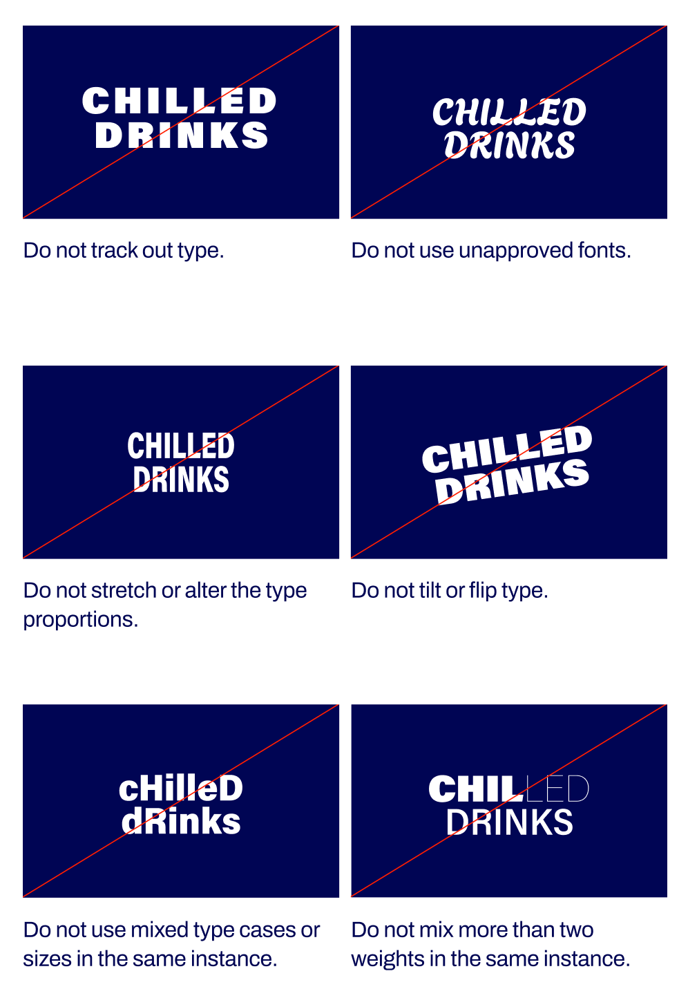
Typographic Restrictions
Avoid the typography mistakes below.


Primary Typeface
Our typographic system is intentionally structured yet flexible. Rather than prescribing a single rigid application, it establishes a framework that supports a range of expressions while preserving clarity, hierarchy, and ease of reading.
All headlines and subheads should be in all-caps with no punctuation, unless punctuation is needed to separate sentences, ask questions, etc. Body copy should be sentence case with punctuation.
Arial may be used for internal materials. For final creative, use Acumin Pro, available through Adobe Creative Cloud. Contact the Creative team to request access.
Billboard-Specific Type Application
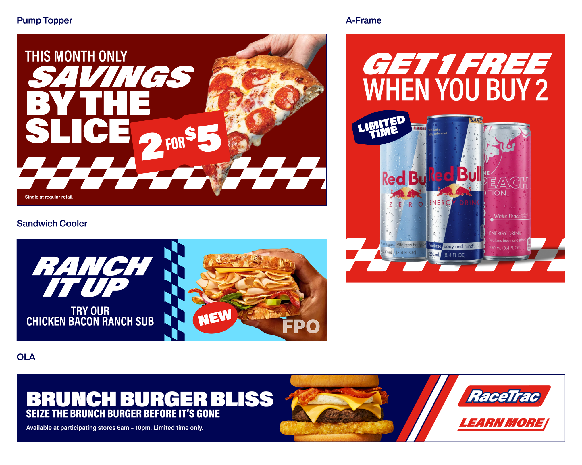
OOH headlines should be short, bold, and easy to read at a glance. Use Acumin Pro Condensed Black for headlines without the RaceTrac slant. Disclaimers are not required on OOH creative, as they are not legible to guests at typical viewing distances.
RaceTrac Slant
In instances where we use short headlines (3 words or under) or need to emphasize specific words, type should be skewed to match the angle of the RaceTrac logo.
Note: readability is the primary objective in general for type.
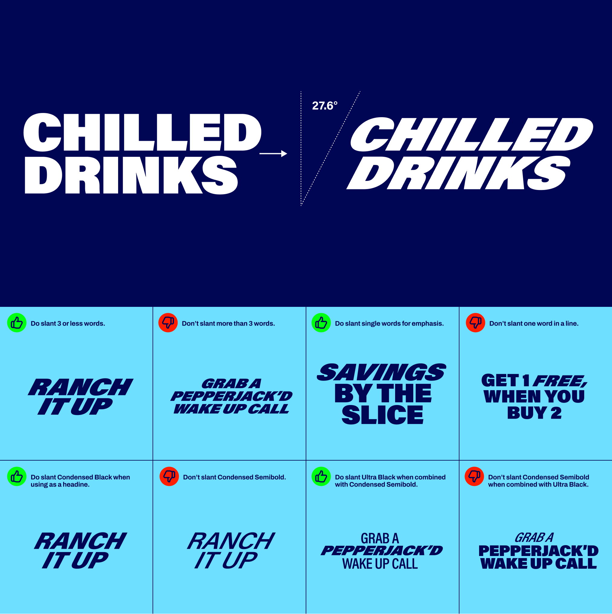
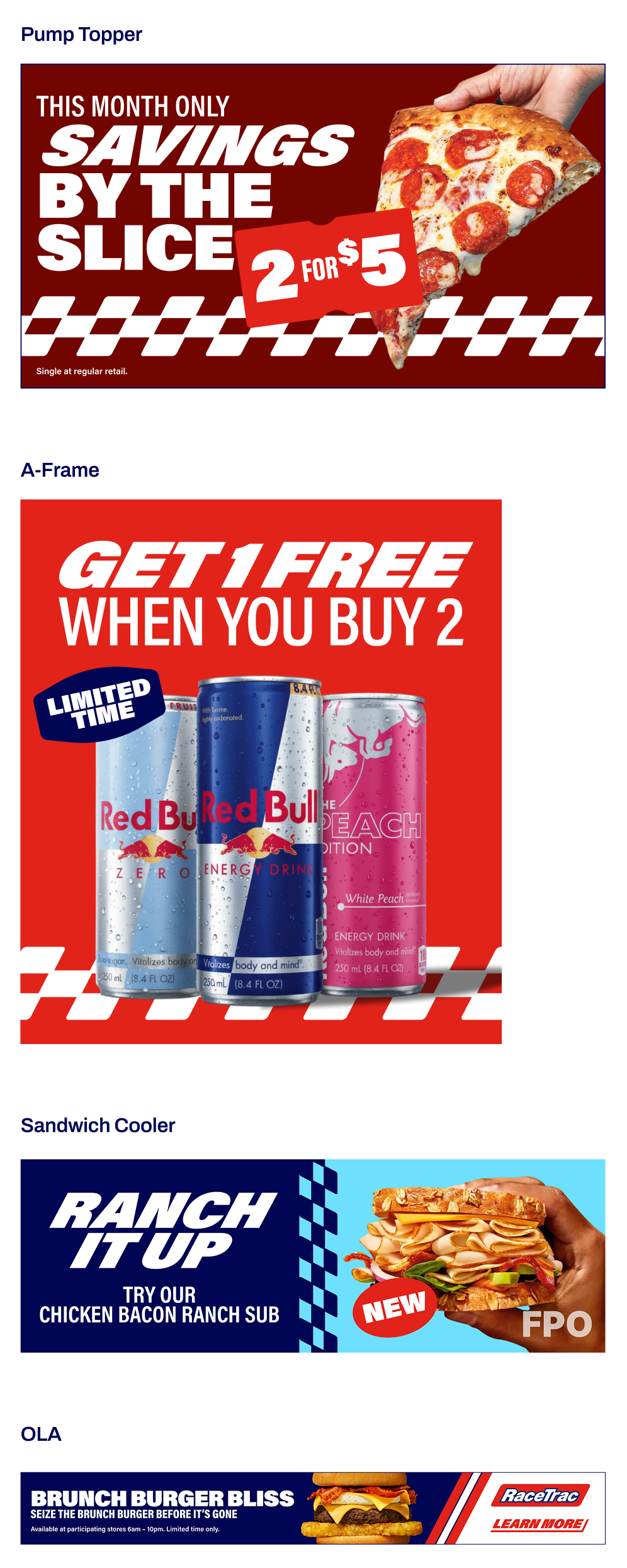
Type Examples
Primary Type Sizing
Always use traditional type sizes. When paired with the specified leading proportions, this will give you a clean baseline grid that aligns with typical screen sizes. Choose type sizes using multiples of 8 as needed.
Typographic Styles
Sizes are ratio-driven, starting with the headline as our base value.
For the best harmony with traditional screen & print resolutions, we recommend common type sizes of 8, 9, 12, 14, 18, 24, 36, 48, 56, 64, 72, 96, etc.
The guides below dictate the default styling of the brand typeface.
Primary Typeface
Font Family: Acumin Pro
Weight: Ultra Black, Condensed Semibold, Condensed Black
Tracking: -20
Size: 8, 9, 12, 14, 18, 24, 36, 48, 56, 64, 72, 96, etc.
Leading: Headline divided by 1.2
Text Style: Uppercase
Paragraph Alignment: Left, Right, or Centered
Primary Typeface
Font Family: Acumin Pro
Weight: Condensed Semibold, Condensed Black
Tracking: -20
Size: 8, 9, 12, 14, 18, 24, 36, 48, 56, 64, 72, 96, etc.
Leading: Headline divided by 1.2
Text Style: Uppercase
Paragraph Alignment: Left, Right, or Centered
Primary Typeface
Font Family: Acumin Pro
Weight: Semibold
Tracking: 0
Size: 8, 9, 12, 14, 18, 24, 36, 48, 56, 64, 72, 96, etc.
Leading: 1.5x font size
Text Style: Sentence Case
Paragraph Alignment: Left, Right, or Centered
Primary Typeface
Font Family: Acumin Pro
Weight: Regular
Tracking: 0
Size: 8, 9, 12, 14, 18, 24, 36, 48, 56, 64, 72, 96, etc.
Leading: 1.5x font size
Text Style: Sentence Case
Paragraph Alignment: Left, Right, or Centered
Typographic Restrictions
Avoid the typography mistakes below.
Brand Overview
Brand Voice
Logo
Colors
Typography
Imagery
Graphic Elements
Layout + Application
Partnerships
Downloads + FAQs
Primary Typeface
Our typographic system is intentionally structured yet flexible. Rather than prescribing a single rigid application, it establishes a framework that supports a range of expressions while preserving clarity, hierarchy, and ease of reading.
All headlines and subheads should be in all-caps with no punctuation, unless punctuation is needed to separate sentences, ask questions, etc. Body copy should be sentence case with punctuation.
Arial may be used for internal materials. For final creative, use Acumin Pro, available through Adobe Creative Cloud. Contact the Creative team to request access.
Billboard-Specific Type Application
OOH headlines should be short, bold, and easy to read at a glance. Use Acumin Pro Condensed Black for headlines without the RaceTrac slant. Disclaimers are not required on OOH creative, as they are not legible to guests at typical viewing distances.
RaceTrac Slant
In instances where we use short headlines (3 words or under) or need to emphasize specific words, type should be skewed to match the angle of the RaceTrac logo.
Only headlines should be slanted. Not subheads, body copy, etc.
Designer Notes:
When slanting type, apply a 27.6° shear and maintain 100% horizontal scale.
When a headline includes numbers, use all caps with titling figures so the numbers visually align with the height of the letters.
Type Examples
Primary Type Sizing
Always use traditional type sizes. When paired with the specified leading proportions, this will give you a clean baseline grid that aligns with typical screen sizes. Choose type sizes using multiples of 8 as needed.
Typographic Styles
Sizes are ratio-driven, starting with the headline as our base value.
For the best harmony with traditional screen & print resolutions, we recommend common type sizes of 8, 9, 12, 14, 18, 24, 36, 48, 56, 64, 72, 96, etc.
The guides below dictate the default styling of the brand typeface.
Headline
Font Family: Acumin Pro
Weight: Ultra Black, Condensed Semibold, Condensed Black
Tracking: -20
Size: 8, 9, 12, 14, 18, 24, 36, 48, 56, 64, 72, 96, etc.
Leading: Headline divided by 1.2
Text Style: Uppercase
Paragraph Alignment: Left, Right, or Centered
Subhead
Font Family: Acumin Pro
Weight: Condensed Semibold, Condensed Black
Tracking: -20
Size: 8, 9, 12, 14, 18, 24, 36, 48, 56, 64, 72, 96, etc.
Leading: Headline divided by 1.2
Text Style: Uppercase
Paragraph Alignment: Left, Right, or Centered
Body
Font Family: Acumin Pro
Weight: Semibold
Tracking: 0
Size: 8, 9, 12, 14, 18, 24, 36, 48, 56, 64, 72, 96, etc.
Leading: 1.5x font size
Text Style: Sentence Case
Paragraph Alignment: Left, Right, or Centered
Qualifier
Font Family: Acumin Pro
Weight: Regular
Tracking: 0
Size: 8, 9, 12, 14, 18, 24, 36, 48, 56, 64, 72, 96, etc.
Leading: 1.5x font size
Text Style: Sentence Case
Paragraph Alignment: Left, Right, or Centered
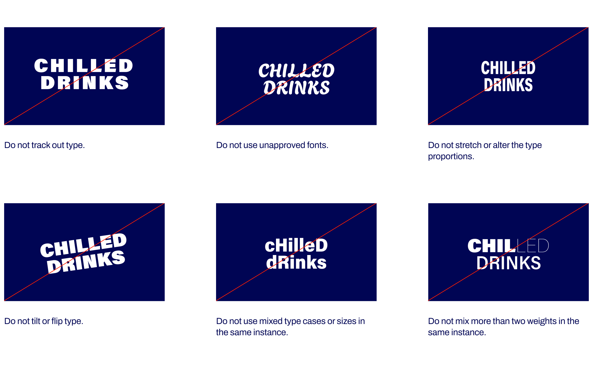
Typographic Restrictions
Avoid the typography mistakes below.