

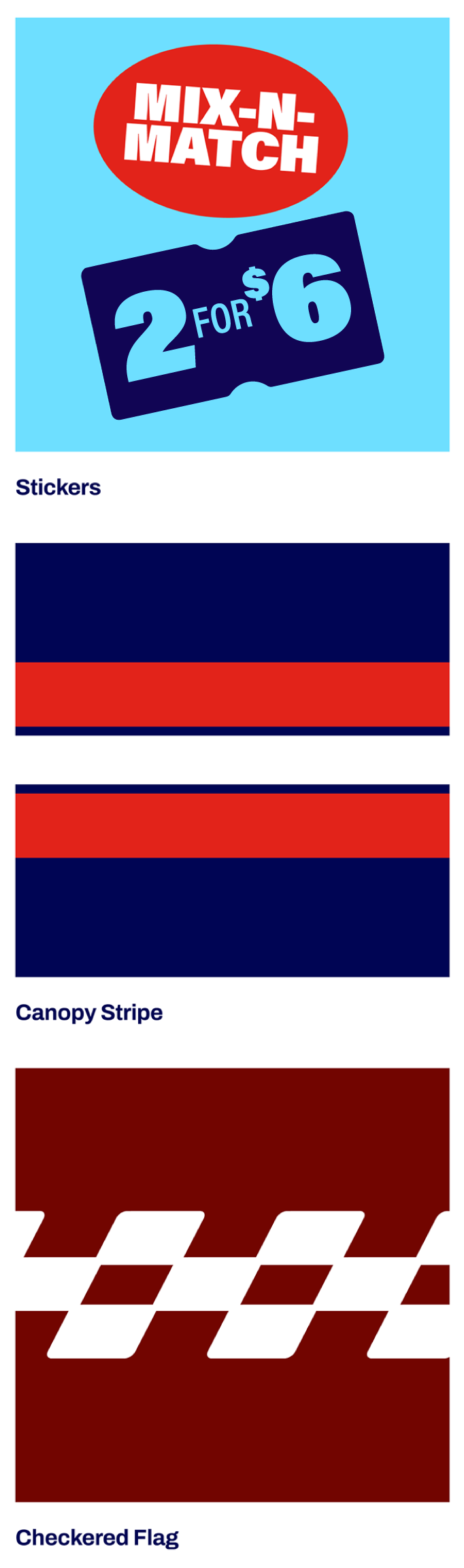
Stickers
Our brand stickers are a joyful element that help deliver important information about our product offerings.
When applying to layout, do not feature more than 1-2 stickers at a time (NEVER 3 within one static composition). They can be used in any color given they follow color pairings outlined in the Color section. Stickers may be rotated slightly clockwise or counter clockwise as needed to fit best within layout.
FPO
Sticker Categories
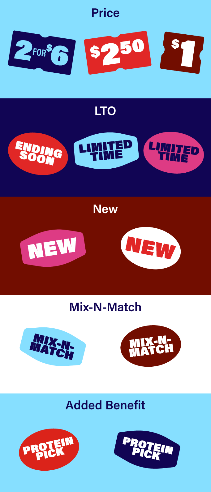
Our stickers fall into the five categories below.
They can be used in any color as long as they follow color pairings outlined in the Color section. Only 1-3 should be used in any given layout.
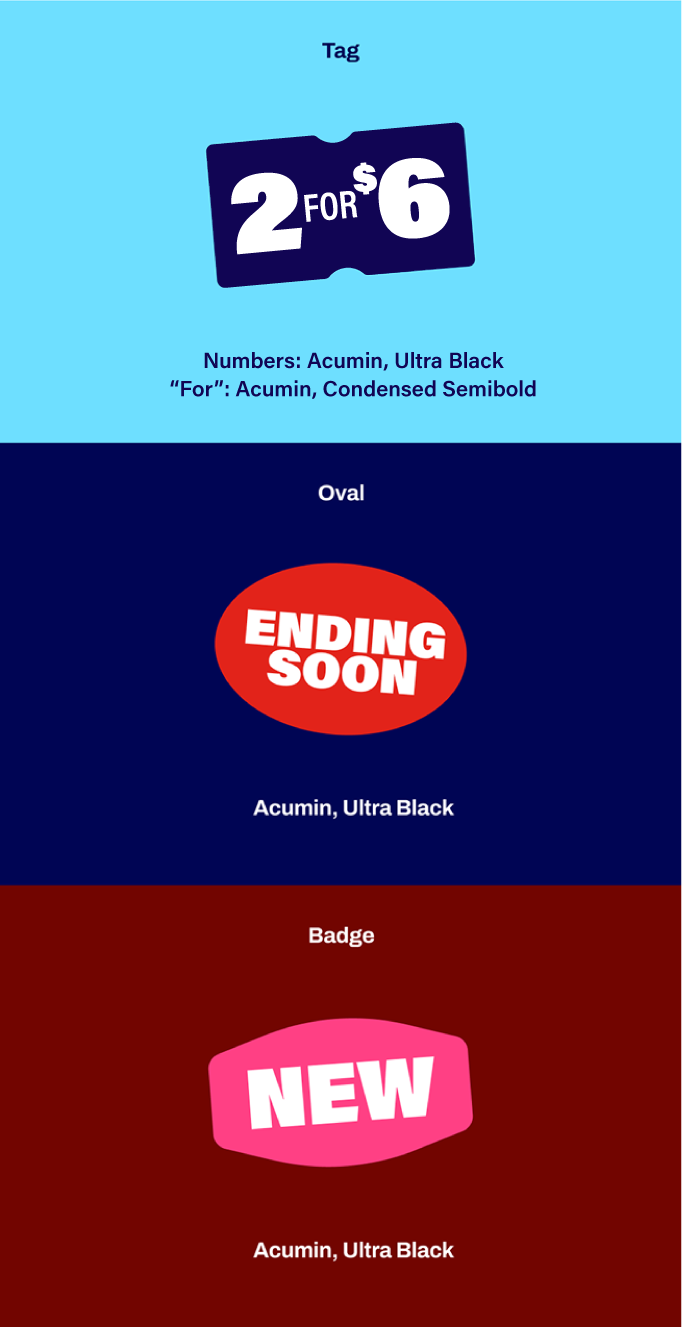
Sticker Typography
Our stickers fall into the five categories below.
They can be used in any color as long as they follow color pairings outlined in the Color section. Only 1-3 should be used in any given layout.
Example Layouts

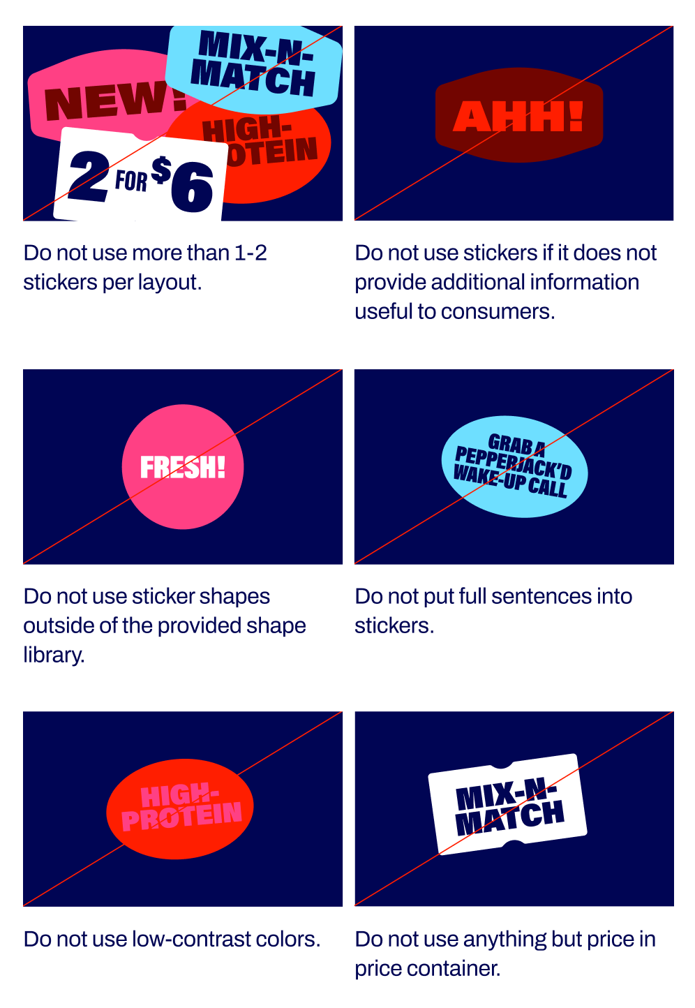
Sticker Restrictions
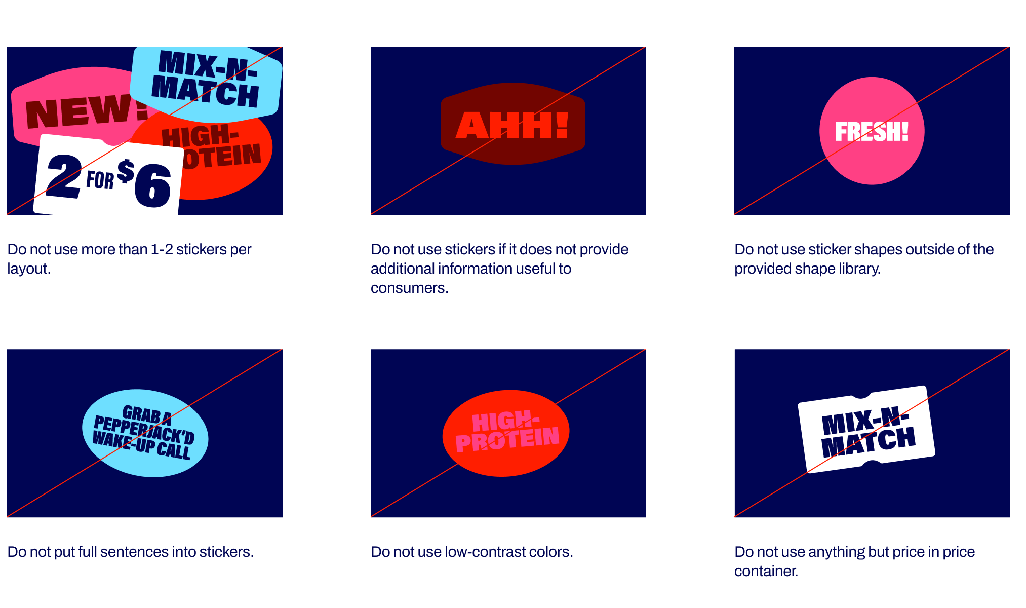
Avoid the sticker mistakes below.
Canopy Stripe
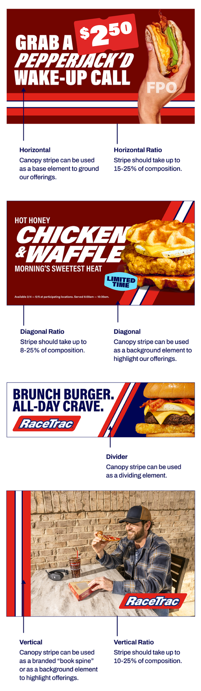
We use our canopy stripe to add texture, dimension, and visual continuity to our brand. It can be used to highlight our offerings as well as add a branded visual to our layouts.
Use canopy as main element and checkered flag as alternative for diversity (especially in markets where we're still building awareness).

Canopy Stripe Orientation
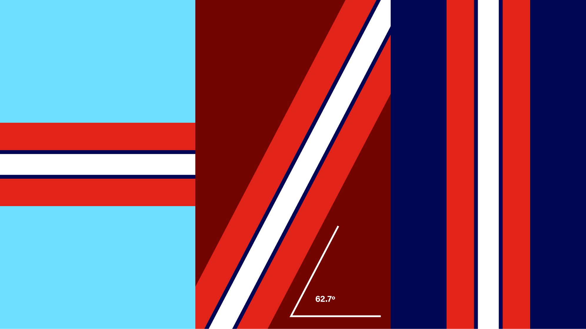
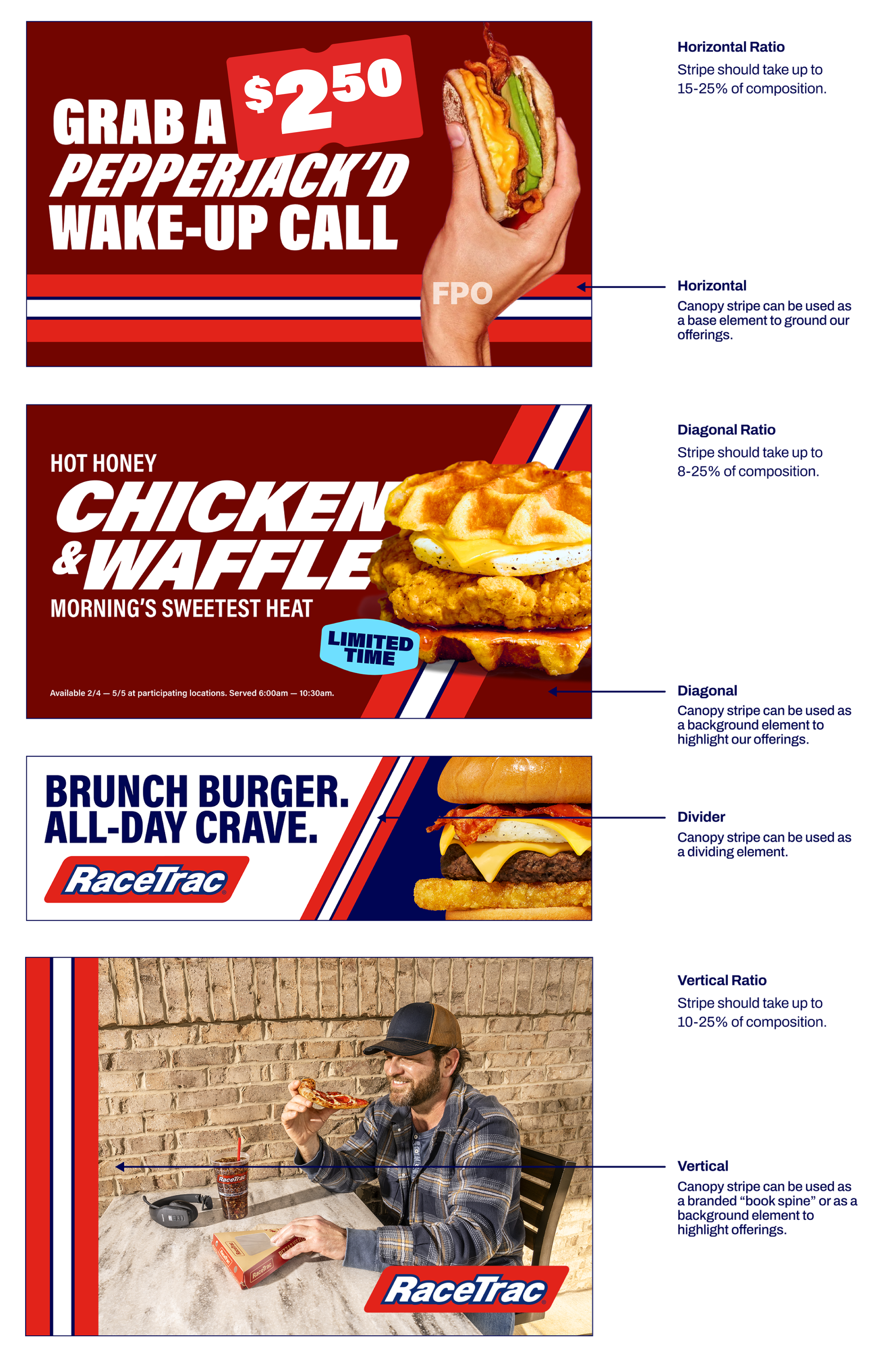
Our canopy stripe should only be used horizontally or diagonally (at the same slant as our logo). It can appear at the bottom of layout to ground our offerings or in the middle to highlight our offerings. It should always appear in the same colorway over all available background colors (Navy, Light Blue, Maroon, White).
Horizontal Stripe Ratio: Stripe should take up to 15-25% of composition | Diagonal Stripe Ratio: Stripe should take up to 8-25% of composition
Example Layouts
Canopy Stripe Restrictions
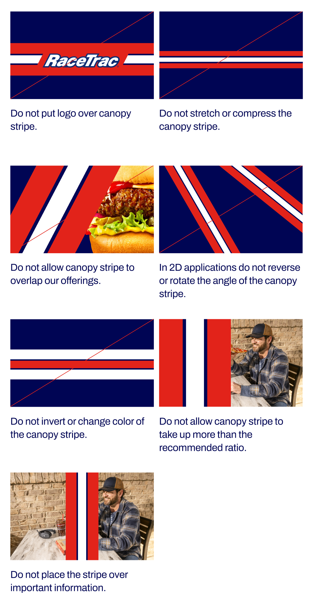
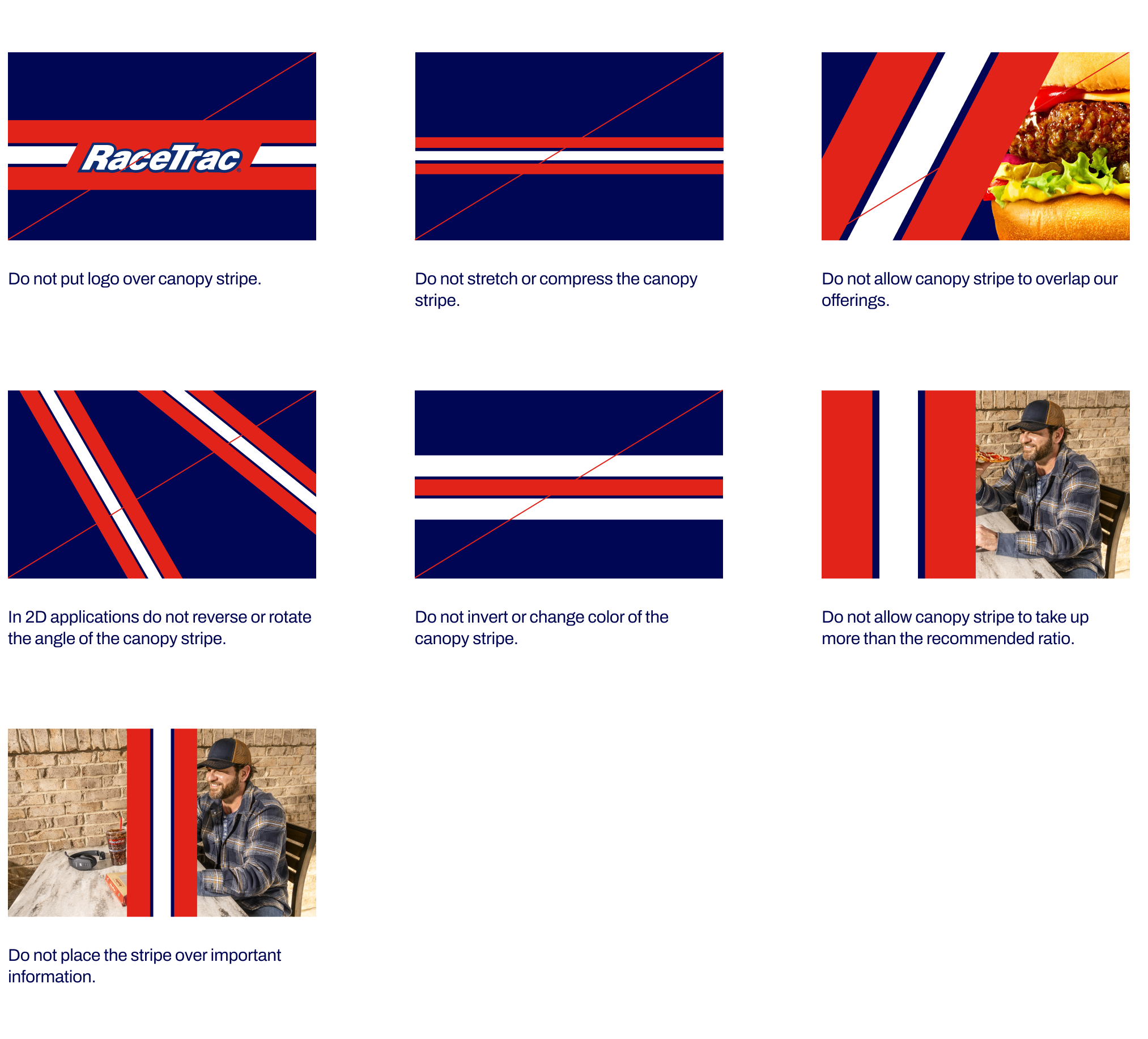
Avoid the canopy mistakes below.
Checkered Flag
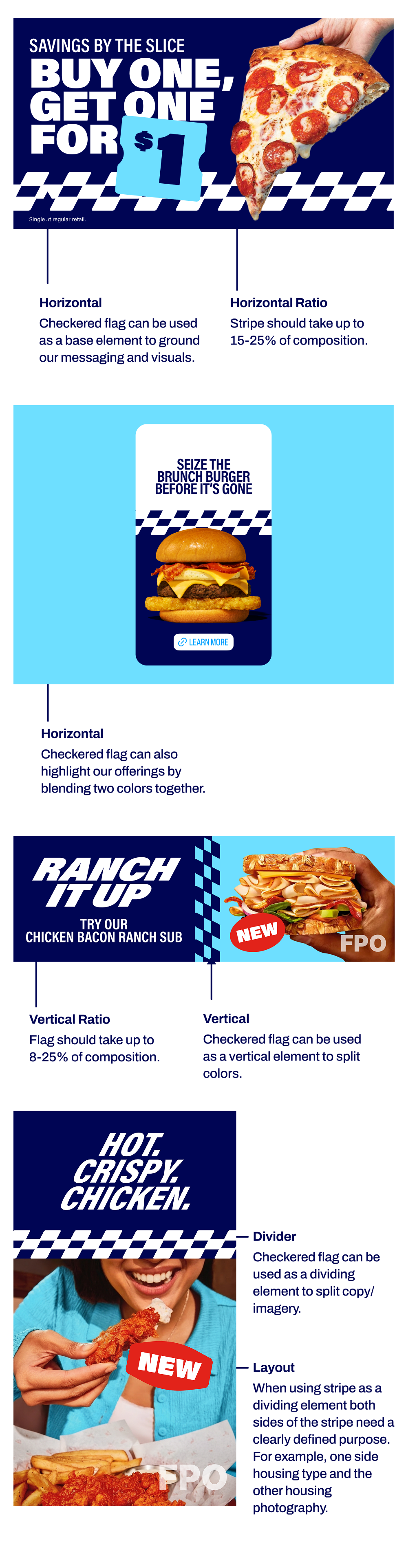
We use our checkered flag to add texture, dimension, and visual joy to our brand. It can be used to highlight our offerings as well as add a branded visual to our layouts. It is built from the RT logo p-gram to ensure ownability and generic/squires should never be used. Also note it is always a row of 3
Use canopy as main element and checkered flag as alternative for diversity (especially in markets where we're still building awareness).

Checkered Flag Orientation
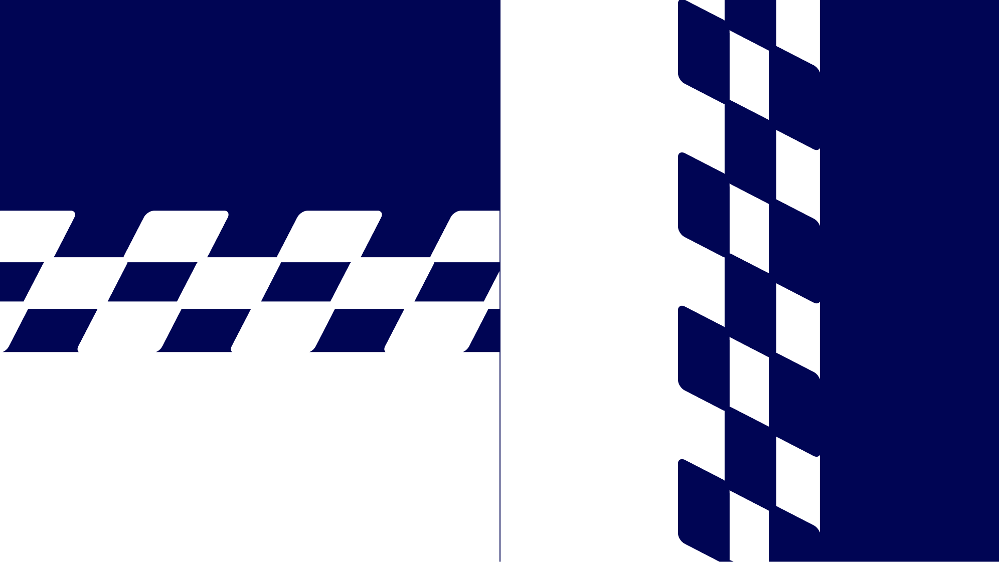
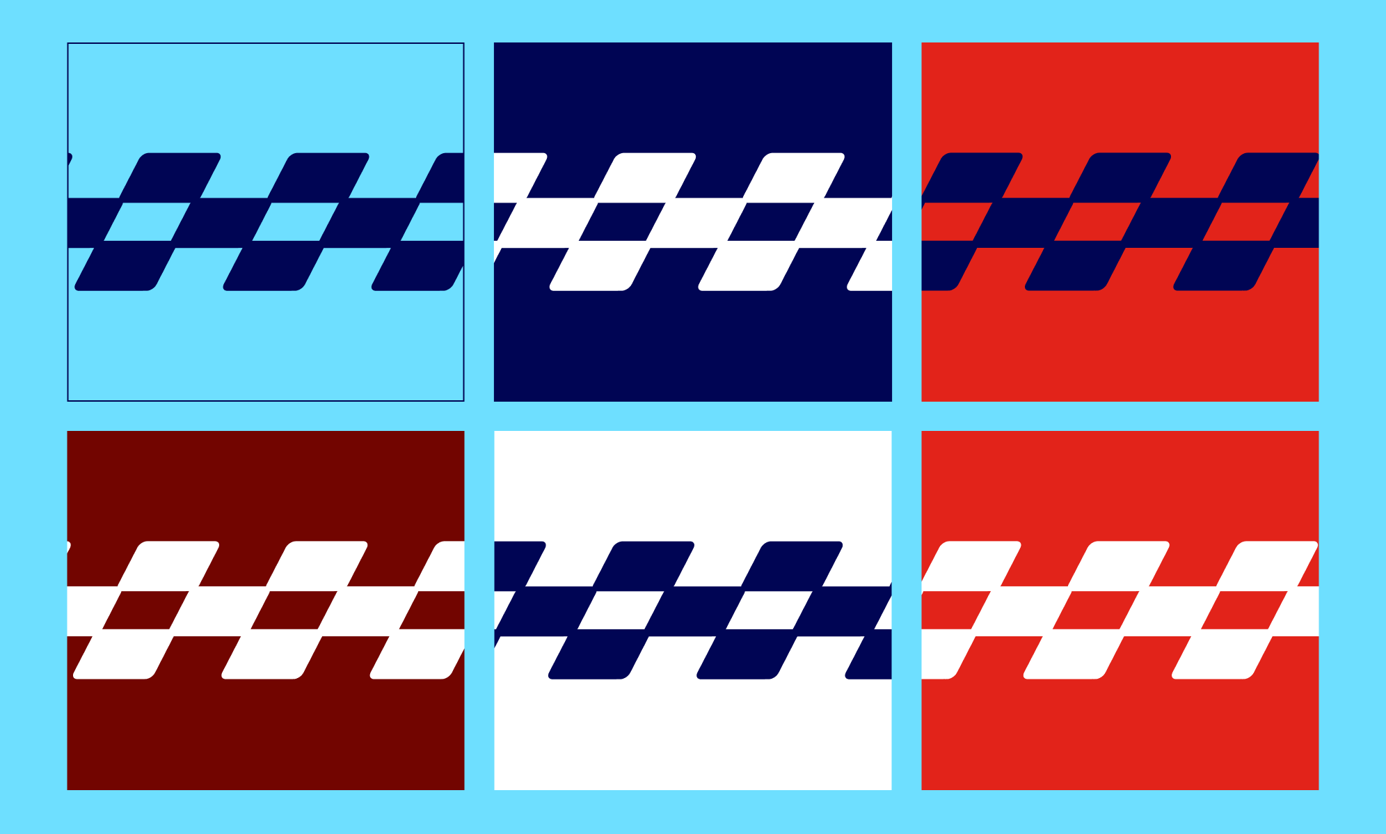
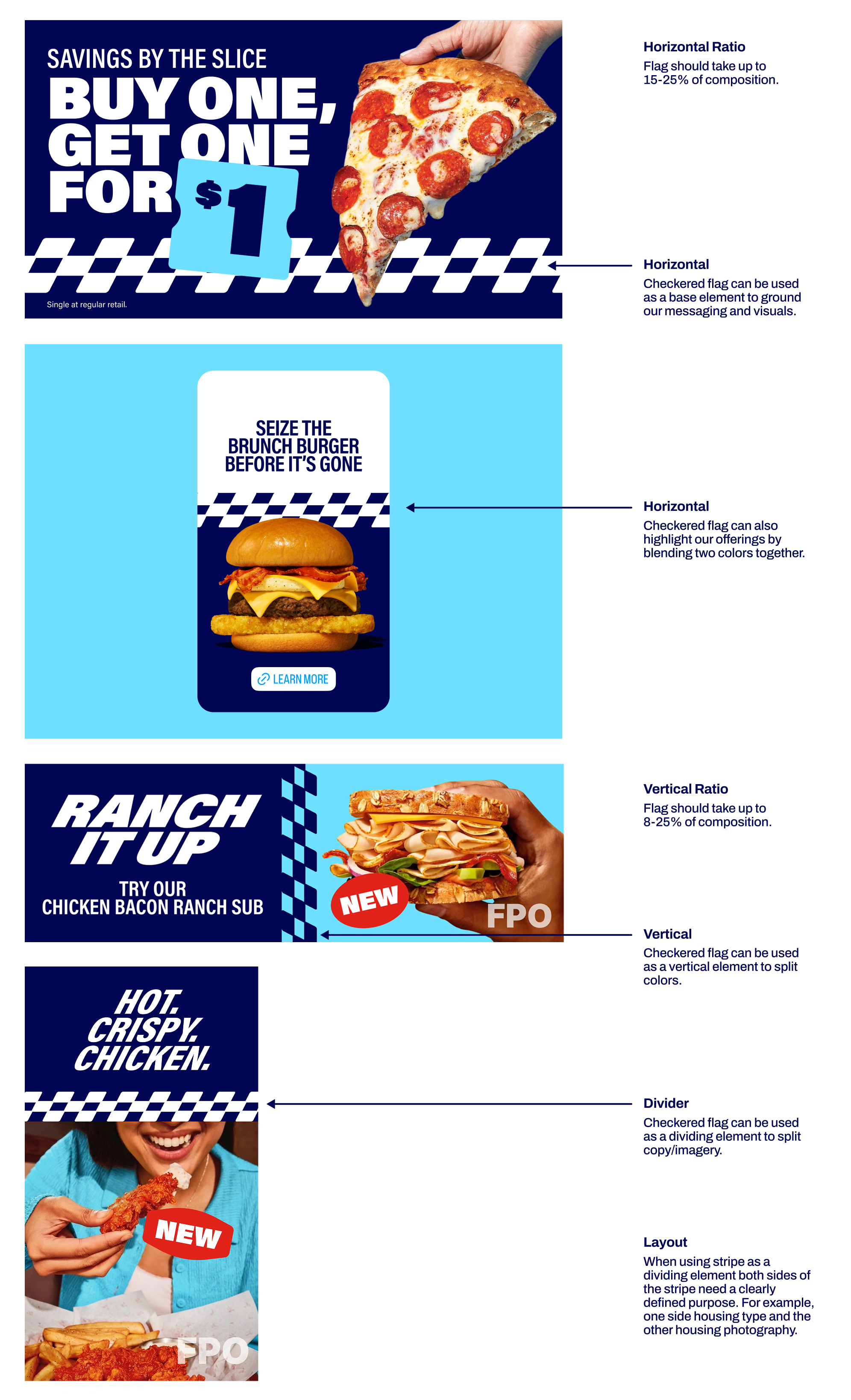
Our checkered flag should only be used horizontally or vertically. It should only appear in either Navy or White over our approved colors.
Standalone Checkered Flag Colorways
When standing alone, our checkered flag should only appear in either Navy or White over our approved colors.
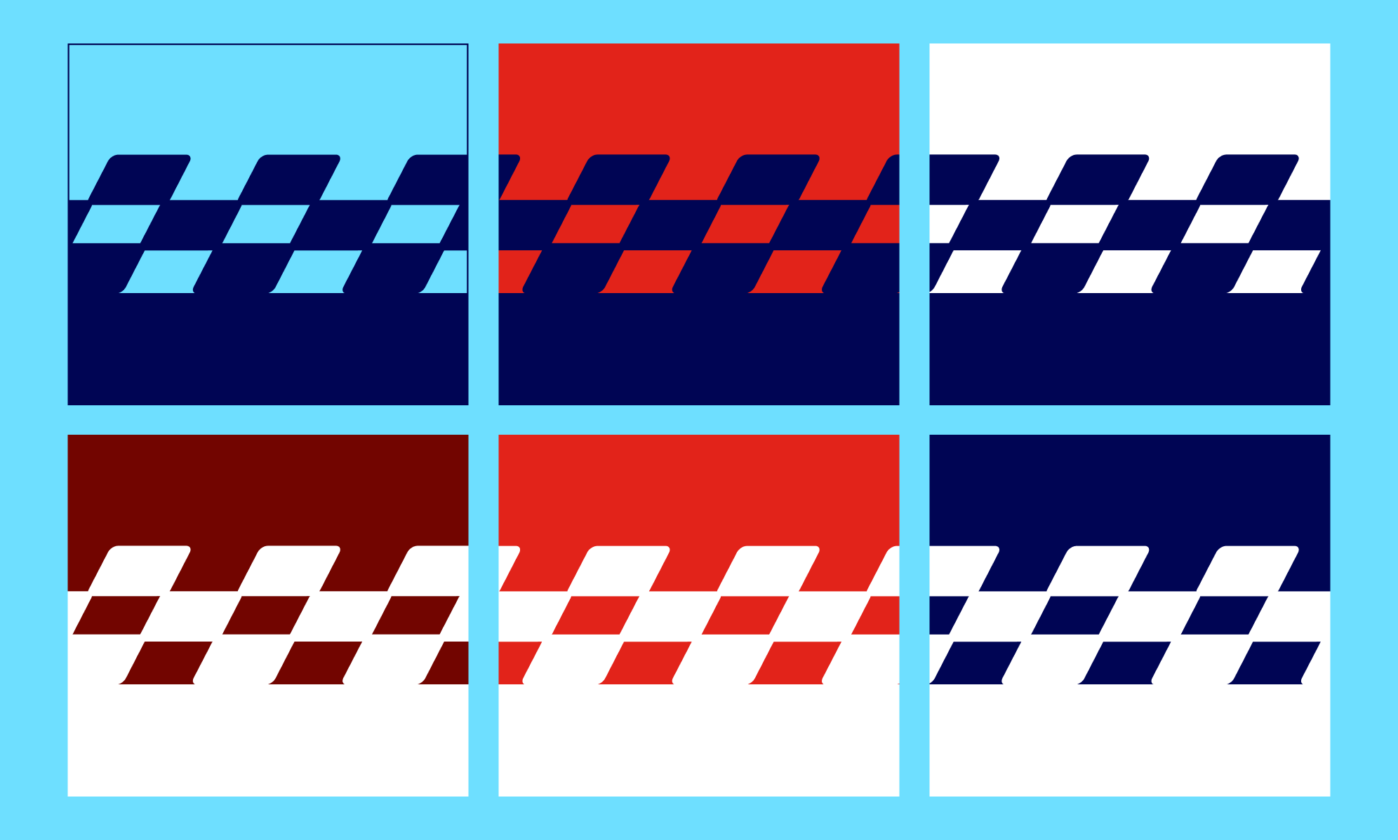
Blended Checkered Flag Colorways
When being blended with another color, our checkered flag should only appear in either Navy or White and blend with the recommended colors below.
Example Layouts
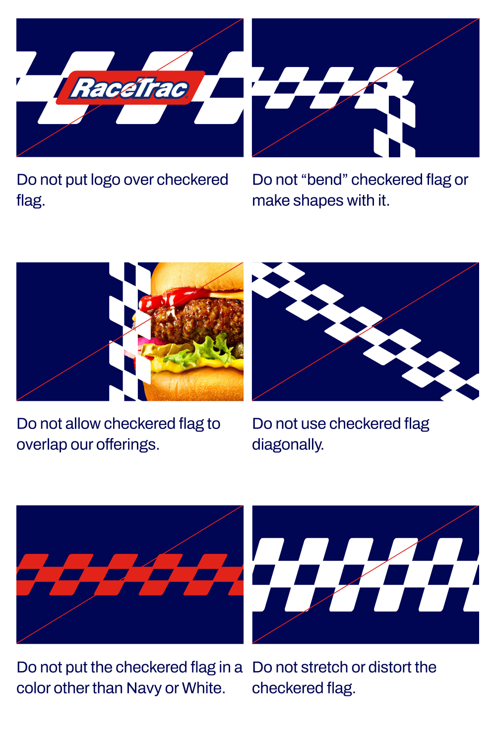
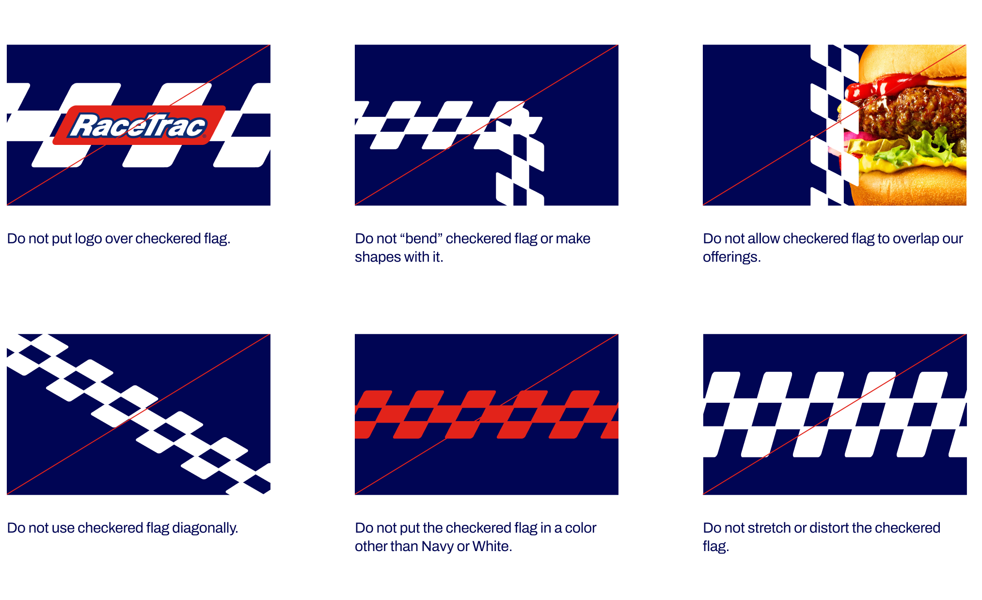
Checkered Flag Restrictions
Avoid the checkered flag mistakes below.


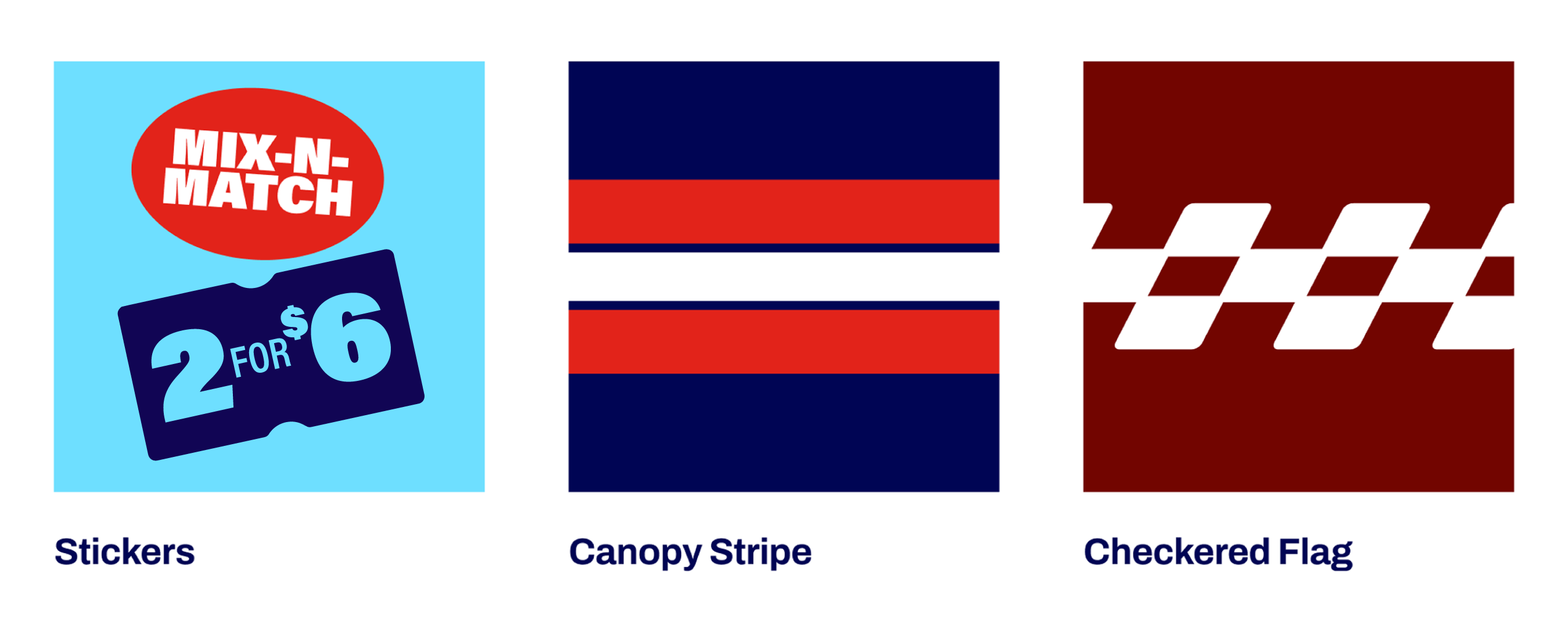
Stickers
Our brand stickers are a joyful element that help deliver important information about our product offerings.
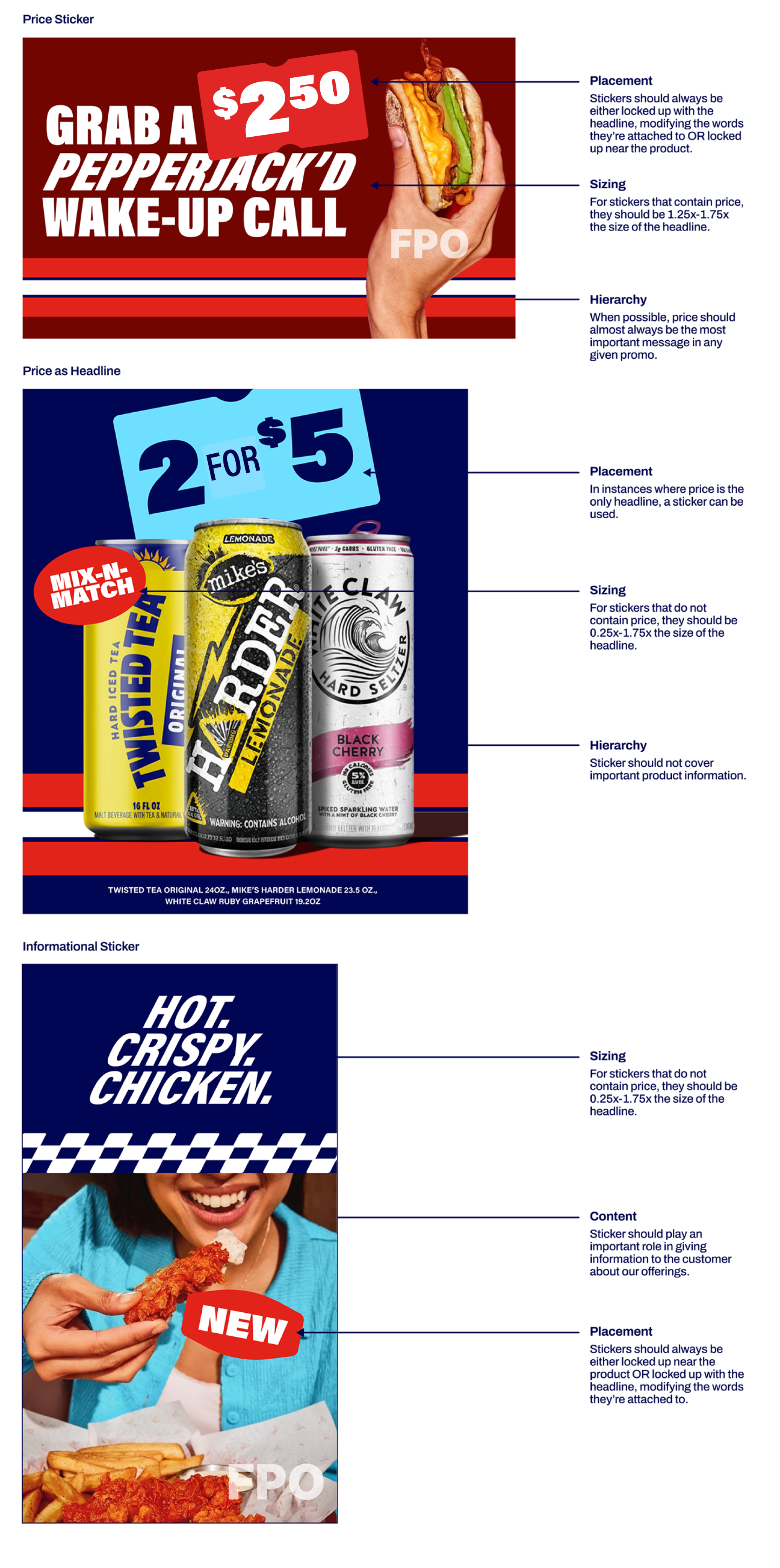
When applying to layout, do not feature more than 1-2 stickers at a time (NEVER 3 within one static composition). They can be used in any color given they follow color pairings outlined in the Color section. Stickers may be rotated slightly clockwise or counter clockwise as needed to fit best within layout.
FPO
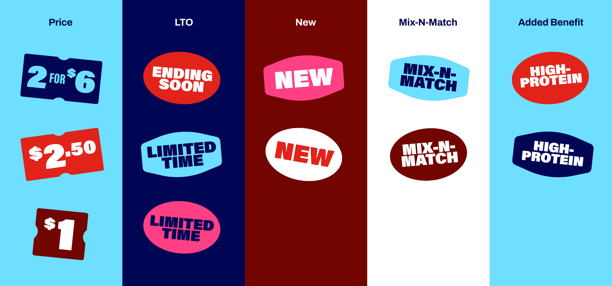
Sticker Categories
Our stickers fall into the five categories below.
They can be used in any color as long as they follow color pairings outlined in the Color section. Only 1-3 should be used in any given layout.
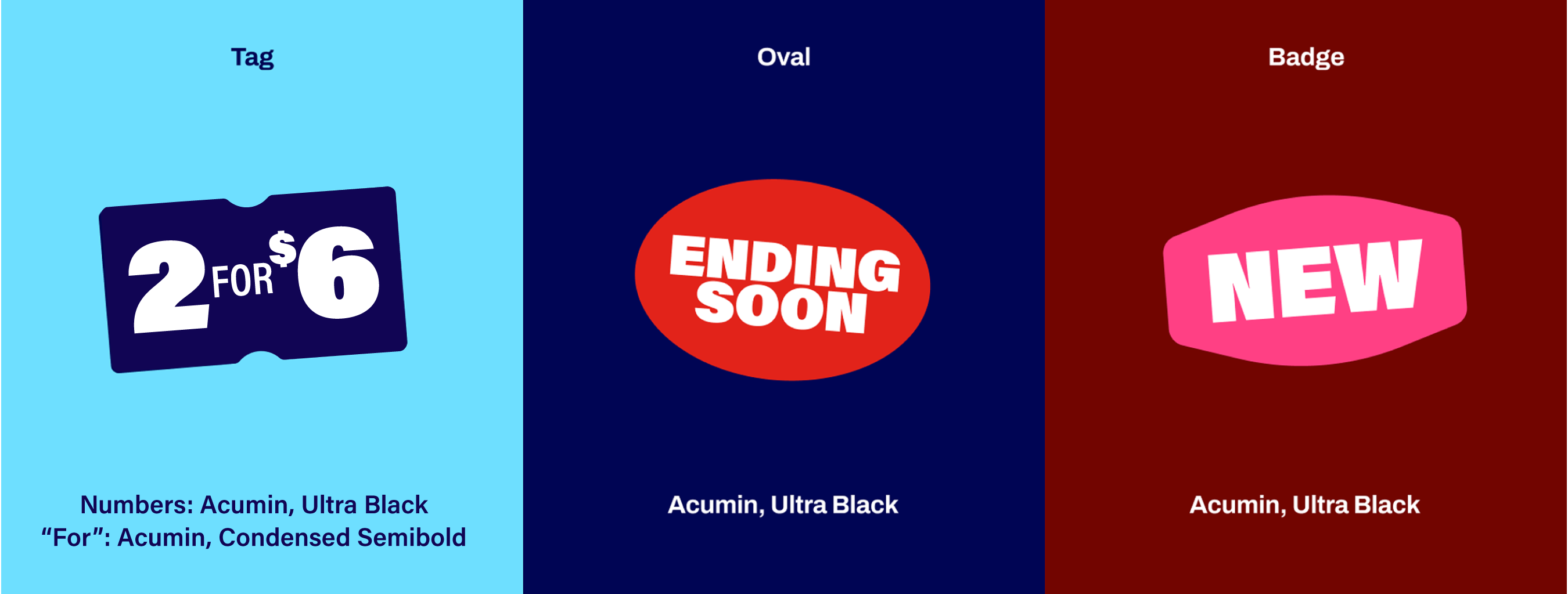
Sticker Typography
Our stickers fall into the five categories below.
They can be used in any color as long as they follow color pairings outlined in the Color section. Only 1-3 should be used in any given layout.
Example Layouts
Sticker Restrictions
Avoid the sticker mistakes below.
Canopy Stripe
We use our canopy stripe to add texture, dimension, and visual continuity to our brand. It can be used to highlight our offerings as well as add a branded visual to our layouts.
Use canopy as main element and checkered flag as alternative for diversity (especially in markets where we're still building awareness).
Canopy Stripe Orientation
Our canopy stripe should only be used horizontally or diagonally (at the same slant as our logo). It can appear at the bottom of layout to ground our offerings or in the middle to highlight our offerings. It should always appear in the same colorway over all available background colors (Navy, Light Blue, Maroon, White).
Horizontal Stripe Ratio: Stripe should take up to 15-25% of composition | Diagonal Stripe Ratio: Stripe should take up to 8-25% of composition
Example Layouts
Canopy Stripe Restrictions
Avoid the canopy mistakes below.
Checkered Flag
We use our checkered flag to add texture, dimension, and visual joy to our brand. It can be used to highlight our offerings as well as add a branded visual to our layouts. It is built from the RT logo p-gram to ensure ownability and generic/squires should never be used. Also note it is always a row of 3
Use canopy as main element and checkered flag as alternative for diversity (especially in markets where we're still building awareness).
Checkered Flag Orientation
Our checkered flag should only be used horizontally or vertically. It should only appear in either Navy or White over our approved colors.
Standalone Checkered Flag Colorways
When standing alone, our checkered flag should only appear in either Navy or White over our approved colors.
Blended Checkered Flag Colorways
When being blended with another color, our checkered flag should only appear in either Navy or White and blend with the recommended colors below.
Example Layouts
Checkered Flag Restrictions
Avoid the checkered flag mistakes below.
Brand Overview
Brand Voice
Logo
Colors
Typography
Imagery
Graphic Elements
Layout + Application
Partnerships
Downloads + FAQs
Stickers
Our brand stickers are a joyful element that help deliver important information about our product offerings.
When applying to layout, do not feature more than 1-2 stickers at a time (NEVER 3 within one static composition). They can be used in any color given they follow color pairings outlined in the Color section. Stickers may be rotated slightly clockwise or counter clockwise as needed to fit best within layout.
FPO
Sticker Categories
Our stickers fall into the five categories below. Only use if you're optimizing all of the horizontal space within a sticker. If you have a singular price that doesn't work/isn’t big enough in a shape, to move it out of the container.
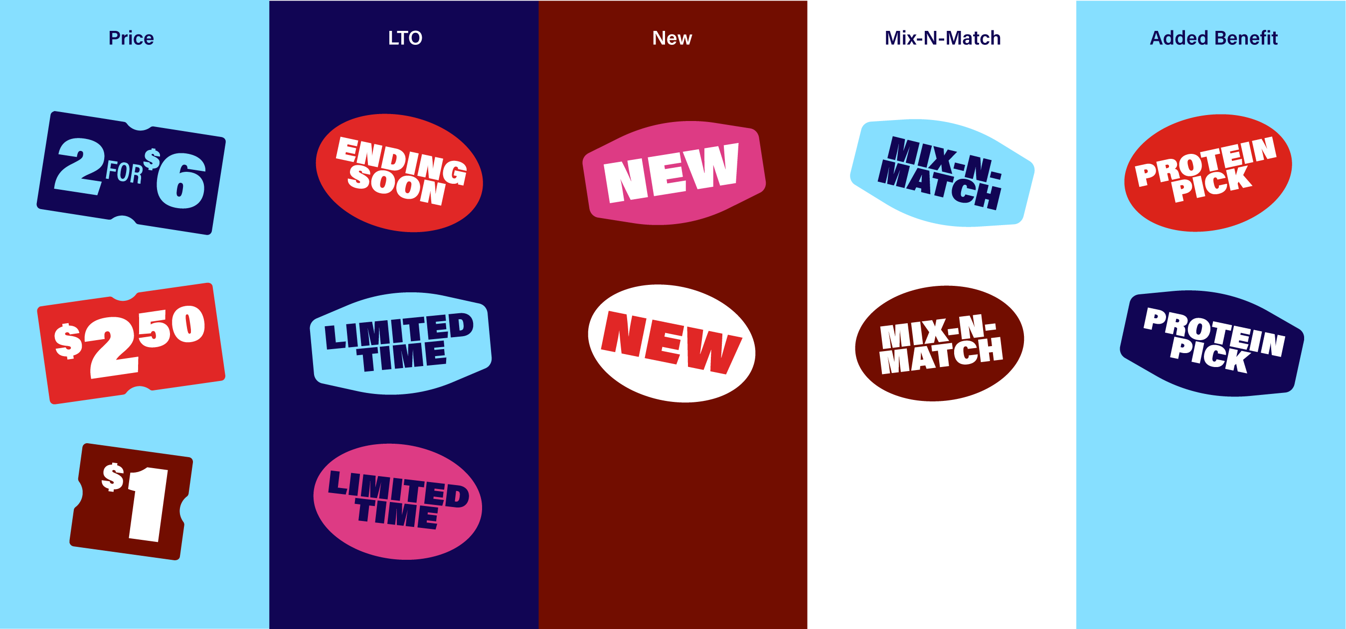
Sticker Typography
Our stickers are more expressive graphic elements so they use various weights outside of our primary communication typography for ultimate legibility. Use the below type guidance for each sticker shape and use for stickers only.
Example Layouts
Sticker Restrictions
Avoid the sticker mistakes below.
Canopy Stripe
We use our canopy stripe to add texture, dimension, and visual continuity to our brand. It can be used to highlight our offerings as well as add a branded visual to our layouts.
Use canopy as main element and checkered flag as alternative for diversity (especially in markets where we're still building awareness).
Canopy Stripe Orientation
Our canopy stripe should only be used horizontally, diagonally (at the same slant as our logo), or vertically. It can appear at the bottom of layout to ground our offerings, in the middle to highlight our offerings, or vertically to highlight offerings/add a branded touch to the page. It should always appear in the same colorway over all available background colors (Navy, Light Blue, Maroon, White).
Example Layouts
Canopy Stripe Restrictions
Avoid the canopy mistakes below.
Checkered Flag
We use our checkered flag to add texture, dimension, and visual joy to our brand. It can be used to highlight our offerings as well as add a branded visual to our layouts. It is built from the RT logo p-gram to ensure ownability. Generic squares/shapes should never be used. Flag should always be in a row of three.
Use canopy as main element and checkered flag as alternative for diversity (especially in markets where we're still building awareness).
Checkered Flag Orientation
Our checkered flag should only be used horizontally or vertically. It can appear at the bottom of layout to ground our offerings or in the middle to highlight our offerings.
Standalone Checkered Flag Colorways
When standing alone, our checkered flag should only appear in either Navy or White over our approved colors.
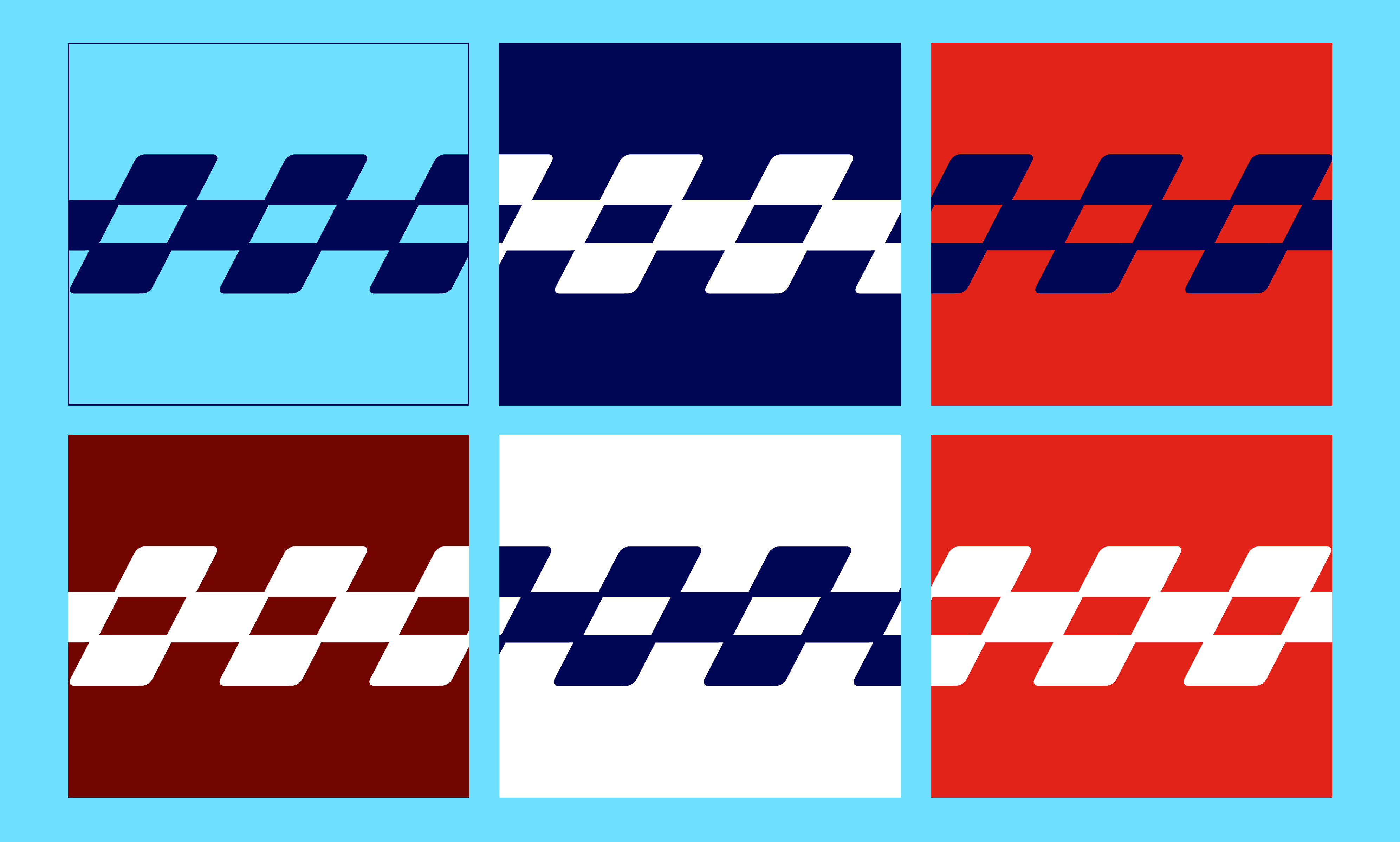
Blended Checkered Flag Colorways
When being blended with another color, our checkered flag should only appear in either Navy or White and blend with the recommended colors below.
Example Layouts
Checkered Flag Restrictions
Avoid the checkered flag mistakes below.